UI cheat sheet: dropdown field
用户界面小抄:下拉字段
Dropdowns get a lot of flak from the UI world – and if we are honest, it’s not without reason. Done badly, they become cumbersome, overwhelming, and ugly. But that’s not what this cheat sheet is about. Here we will talk about what to do when you have to use them.
下拉菜单在用户界面领域备受诟病--老实说,这并非毫无道理。如果使用不当,下拉菜单就会变得繁琐、不堪重负、丑陋不堪。但这并不是本小抄要讨论的内容。在这里,我们将讨论当你不得不使用它们时该怎么做。
I also want to clarify that there are two main types of dropdowns: those used for navigation and those used in forms. For this cheat sheet’s purpose, we will just be looking at the form variant.
我还想说明的是,下拉菜单主要有两种类型:用于导航的下拉菜单和用于表单的下拉菜单。在本小抄中,我们将只讨论表单中的下拉菜单。
In this cheat sheet, we will go over the following:
在这份小抄中,我们将介绍以下内容:
- Anatomy 解剖学
- Dropdown types and variations
下拉类型和变化 - Dropdown styles 下拉样式
- Dropdown states 下拉状态
- What the placeholder should say
占位符应说明的内容 - When not to use a dropdown (and when to)
何时不使用下拉菜单(何时使用) - Native dropdowns 本地下拉菜单
- Accessibility checklist 无障碍设施清单
- Closing thoughts 结束语
1. Anatomy 1.解剖学
The anatomy of a dropdown is very similar to that of a text input field - plus a bit more. To compare the two, see this earlier story.
下拉菜单的结构与文本输入字段非常相似,只是多了一点。如需比较二者,请参阅本篇早期报道。

2. Dropdown types and variations
2.下拉类型和变化
While standard dropdowns are widely understood, there are a few different types and variations that you may need to consider for your next endeavour. Please note that for these examples I am only including dropdowns used in forms and not those used in navigation.
虽然标准下拉菜单广为人知,但您在下一次使用时可能还需要考虑一些不同的类型和变化。请注意,在这些示例中,我只包括表单中使用的下拉菜单,而不包括导航中使用的下拉菜单。
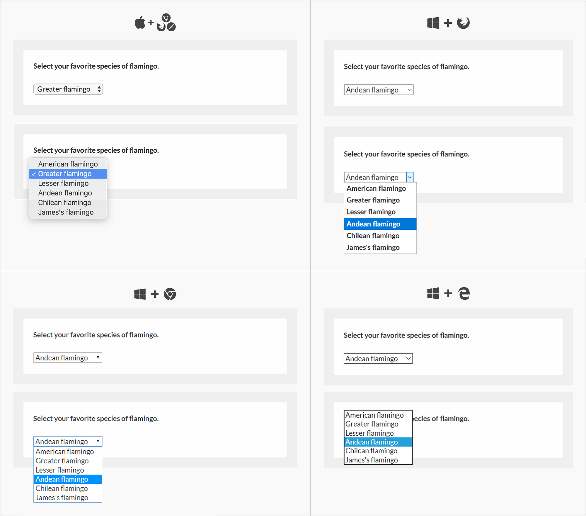
Standard dropdown 标准下拉菜单
The standard dropdown is what we think of when we hear the word ‘dropdown’. In its active state, it should look very similar to a text input field until you click on it and it opens up a menu.
一听到 "下拉菜单",我们就会想到标准下拉菜单。在激活状态下,它看起来与文本输入框非常相似,直到你点击它,它才会打开一个菜单。
Dropdown with autosuggest
带自动建议的下拉菜单
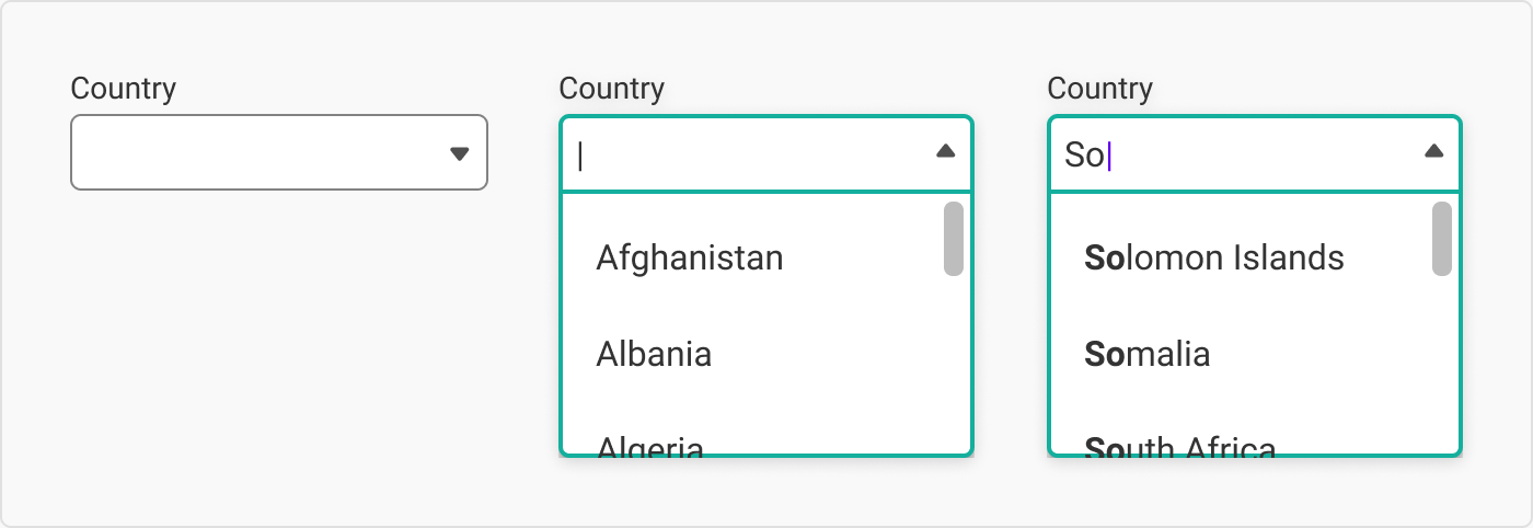
I love these sexy bad boys. The first time I was aware of autosuggest was in Google’s search field; however, I have no idea where it was first implemented. (Let me know if you do.) It is especially useful when you have long lists where the user already knows the answer (e.g. what country you are from).
我喜欢这些性感的坏男孩。我第一次意识到自动建议是在谷歌的搜索栏中;不过,我不知道它是在哪里首次实现的(如果你知道,请告诉我)。(如果你知道,请告诉我。)它在用户已经知道答案的长列表中尤其有用(例如,你来自哪个国家)。
带自动建议的下拉菜单
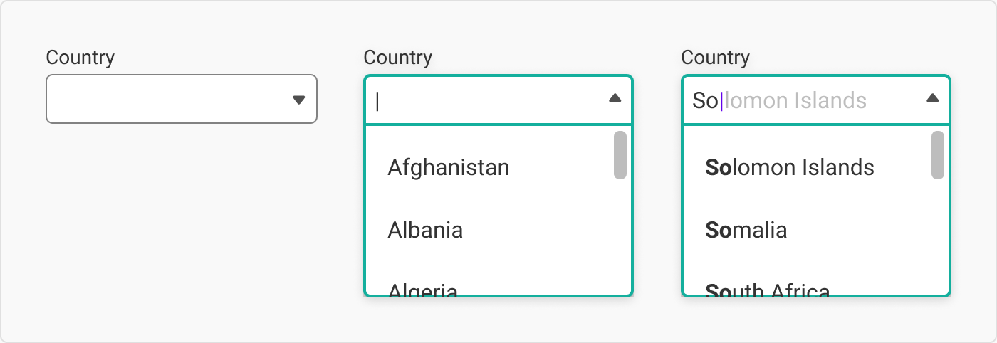
Dropdown with autocomplete and autosuggest
带自动完成和自动建议功能的下拉菜单
Autosuggest isn’t to be confused with autocomplete. Autosuggest is when the input field reveals options for the user to select from. Autocomplete is when the input puts forward a way to complete the word or phrase.
自动建议与自动完成不能混为一谈。自动建议是指输入框显示选项供用户选择。而自动完成是指输入会提出完成单词或短语的方法。
带自动完成和自动建议功能的下拉菜单
Autocomplete fields are sometimes disguised as text inputs until you start typing.
自动完成字段有时会伪装成文本输入,直到你开始键入。
Dropdown with multi-select
带多选功能的下拉列表
While most dropdowns are an extension of radio buttons (in that you can only choose one item), this dropdown is an extension of checkboxes: the user can select multiple items in one input field.
大多数下拉菜单都是单选按钮的扩展(只能选择一个项目),而这个下拉菜单则是复选框的扩展:用户可以在一个输入框中选择多个项目。
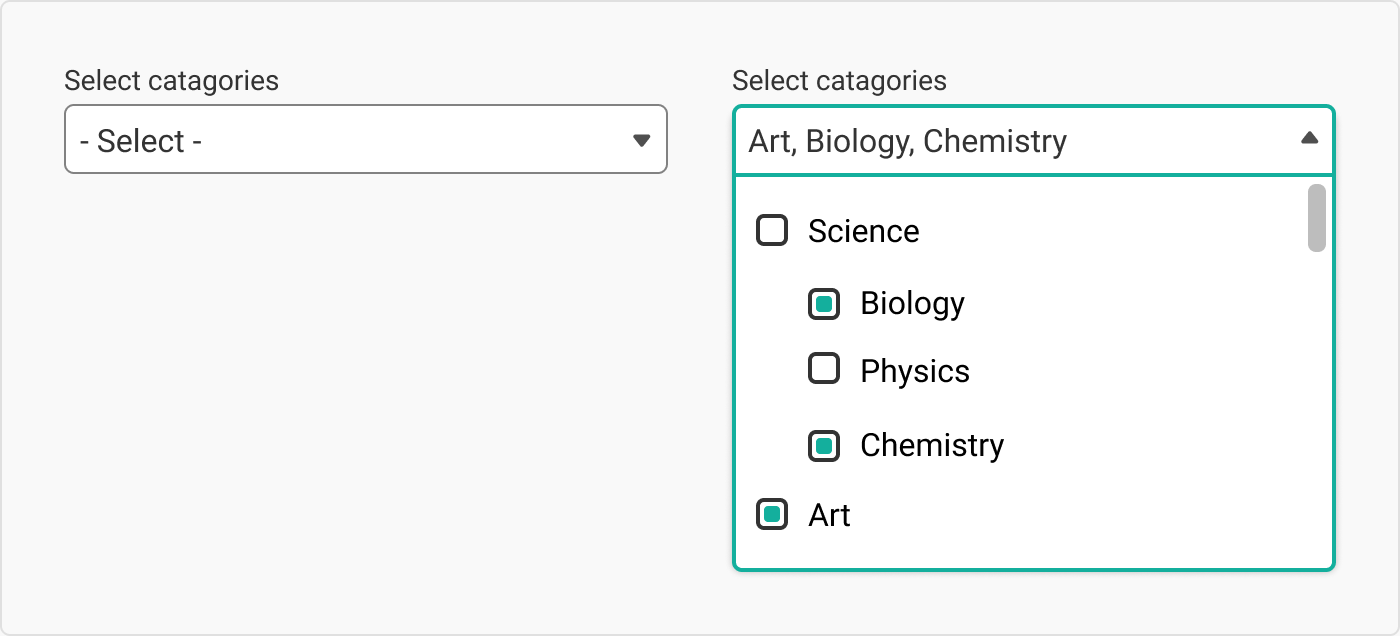
带多选功能的下拉列表
If possible, try to avoid this guy. I’ve had to use it due to an insanely long list of categories, and I still wake up at night in cold sweats over that decision. Ideally, one would want an autosuggest & autocomplete combo.
如果可能的话,尽量避免使用这家伙。由于类别列表太长,我不得不使用它,现在我还会为这个决定吓出一身冷汗。理想情况下,人们会想要一个自动建议和自动完成的组合。
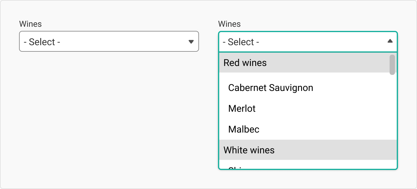
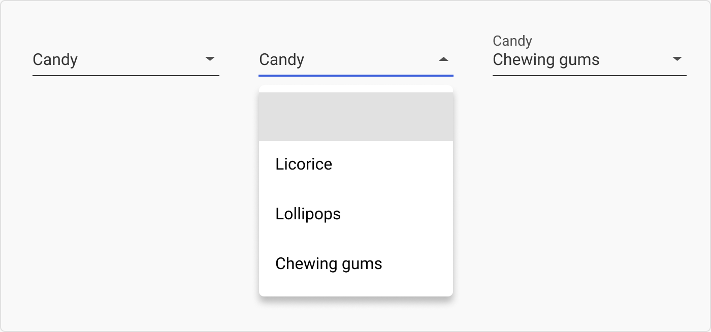
Dropdown with groups 带组的下拉菜单
While long dropdowns are not ideal, you can group some of the items under different categories to make searching for what you want easier.
虽然长下拉菜单并不理想,但您可以将一些项目归入不同的类别,以便更容易搜索到您想要的内容。
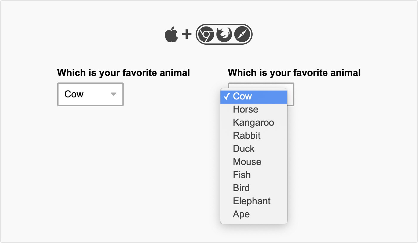
Multiple select menu 多选菜单
While not technically a dropdown, a multiple select menu is an alternative to consider. Unlike a dropdown, they are open from the start and are basically a little scroll window.
多选菜单虽然在技术上不是下拉菜单,但也是一个可以考虑的替代方案。与下拉菜单不同,多选菜单从一开始就是开放的,基本上就是一个小滚动窗口。
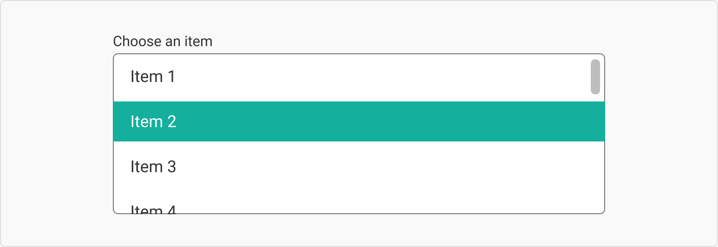
While they are fine for desktop, they are kind of awful for mobile as they are a ‘scroll within a scroll’.
虽然它们在台式机上还不错,但在移动设备上就有点糟糕了,因为它们是 "滚动中的滚动"。
I, personally, have only ever used this pattern once (under duress, I might add), and I seldom see them in the wild. If anyone has any more information on them, please let me know in the comments :)
我个人只使用过一次这种模式(我要补充的是,是在被迫的情况下),而且我很少在野外看到它们。如果有人有更多关于它们的信息,请在评论中告诉我:)
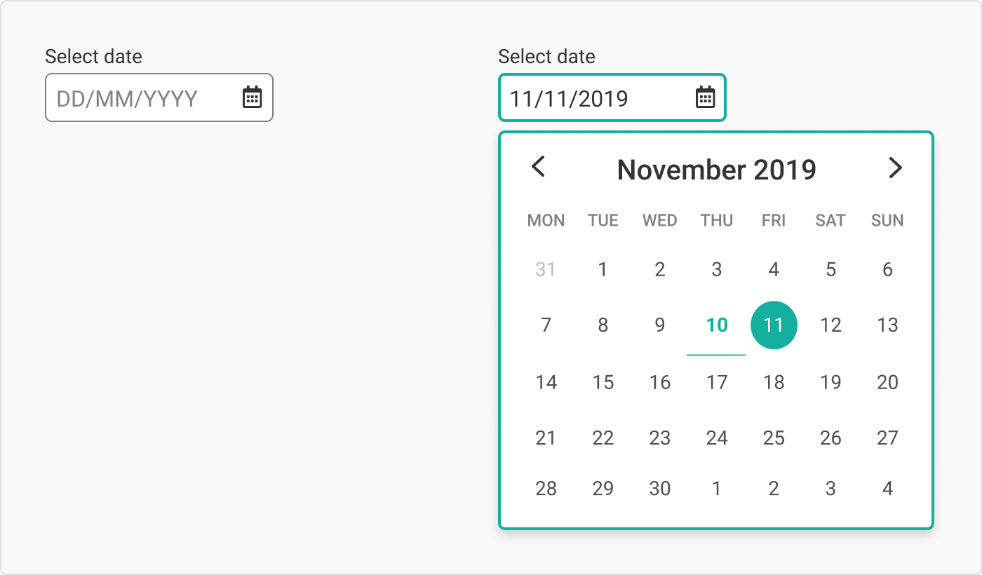
Date picker 日期选择器
Date pickers should only be used for scheduling meetings, events, etc. Having a calendar with the days of the week is great for helping you decide when to organise brunch but is incredibly annoying if you want to enter your passport expiry date. I like the ones where you can type as well as select from the dropdown – just make sure the input is clever enough to add ‘/’ between your months, days, and years, otherwise it gets a bit confusing.
日期选择器只能用于安排会议、活动等。日历上标注一周的日期可以帮助你决定何时组织早午餐,但如果你想输入护照到期日期,那就非常烦人了。我喜欢那种既可以输入,也可以从下拉菜单中选择的日历--只要确保输入法足够聪明,能在月、日、年之间添加"/",否则就会有点混乱。
Tess’s guide on how to make people hate you:
泰丝如何让别人讨厌你的指南:
- When asking people to enter the day their card or passport expires, give them calendar dropdown menu. They especially care to see exactly what day of the week that their card will expire.
当要求人们输入他们的银行卡或护照的到期日时,给他们提供日历下拉菜单。他们特别想知道他们的银行卡将在一周中的哪一天到期。 - When asking users to input their date of birth, use a dropdown calendar. Bonus points: Make sure that the only way that they can navigate through the years is by clicking through each month. Bonus bonus points: This design pattern is especially useful on online forms for retirement home applications.
要求用户输入出生日期时,使用下拉日历。加分:确保用户只能通过点击每个月来浏览年份。额外加分:这种设计模式尤其适用于养老院申请的在线表单。
Date pickers and date range pickers are complicated beasts, so I haven’t gone into too much detail here, but maybe one day I will do a special date picker cheatsheet. Maybe.
日期选择器和日期范围选择器是很复杂的东西,所以我没有在这里说得太详细,但也许有一天我会做一个专门的日期选择器小抄。也许吧。
3. Dropdown styles 3.下拉样式
Unlike dropdown types, ‘dropdown styles’ refers to how the dropdown actually looks and not how it works. Below I have listed some of the common styles.
与下拉类型不同,"下拉样式 "指的是下拉的实际外观,而不是其工作方式。下面我列出了一些常见的样式。
Standard style (attached)
标准样式(附后)
I call this style the ‘standard’ because it is what we are most used to seeing.
我称这种风格为 "标准",因为它是我们最常见的风格。
标准样式(附后)
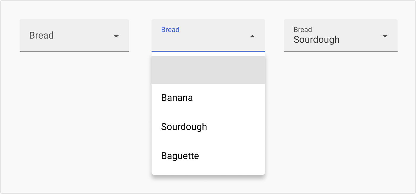
Standard style (detached)
标准样式(独立式)
I am seeing the style with the detached menu more and more. Which makes sense as it allows the menu to sit above or below the field depending on the browser viewport.
我越来越多地看到分离式菜单的样式。这是有道理的,因为它可以根据浏览器的视口,让菜单位于字段的上方或下方。
标准样式(独立式)
Rounded borders 圆形边框
Rounded borders work great with UIs that have a more playful persona.
圆形边框非常适合俏皮的用户界面。
With icons 带图标
Adding a simple icon to the beginning of an input can make it look more ‘designed’. Whenever someone complains that a form looks too boring (‘Well Steve, its a form with 20 inputs – what did you think it was going to look like?’), I just add icons. It is a simple fix.
在输入的开头添加一个简单的图标,可以让输入看起来更有 "设计感"。每当有人抱怨表单看起来太无聊时("史蒂夫,这是一个有 20 个输入项的表单,你以为它会是什么样子?这是一个简单的修复方法。
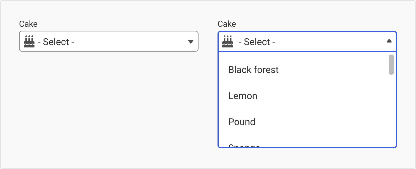
Lazy Designer Tip: If someone complains about a long form looking boring just add icons. It’s a tried and true method that requires almost no effort and your product owner will think you are the best thing since Sunday morning pancakes.
懒惰的设计师小贴士:如果有人抱怨长表单看起来无聊,只需添加图标即可。这是一种屡试不爽的方法,几乎不费吹灰之力,而且你的产品负责人会认为你是周日早晨煎饼之后最棒的事情。
With images 附图片
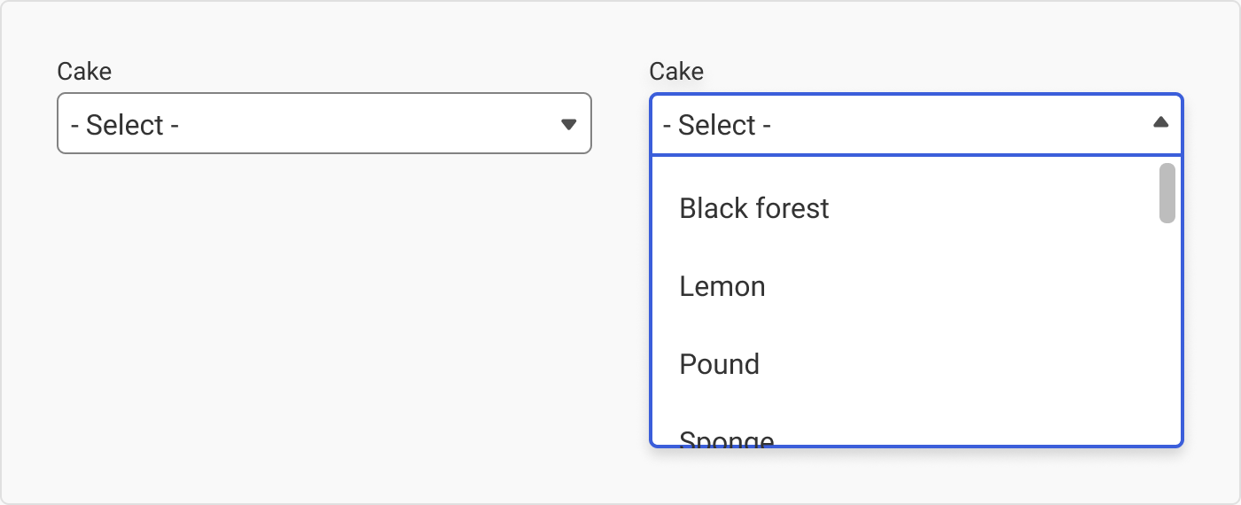
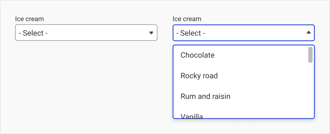
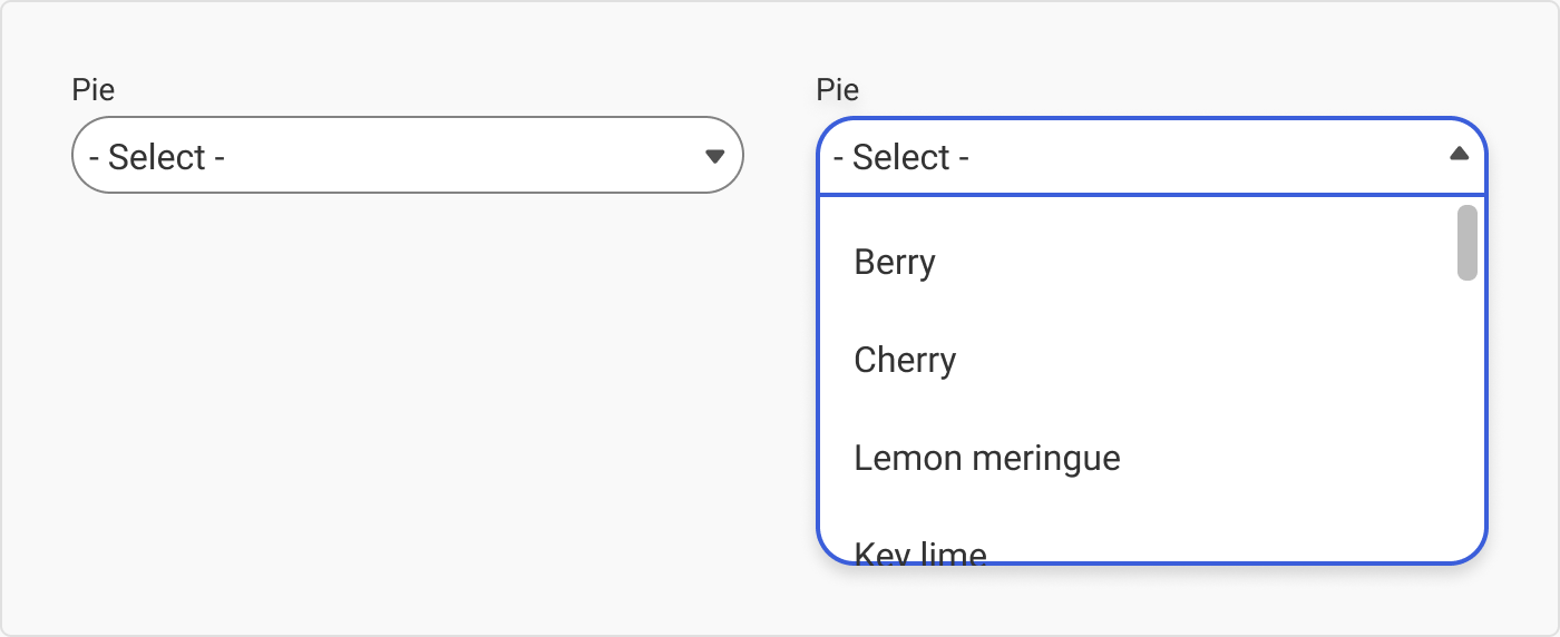
As a rule, I avoid adding images to items in a dropdown – just because the maintenance behind having to update it is a pain, especially if it is a list that changes a lot. However, it is very useful when you want to show the difference between things (dog breeds, cakes, office furniture, etc).
通常,我避免为下拉菜单中的项目添加图片,因为更新维护起来很麻烦,尤其是在列表经常变化的情况下。不过,当你想显示事物(狗的品种、蛋糕、办公家具等)之间的区别时,这就非常有用了。
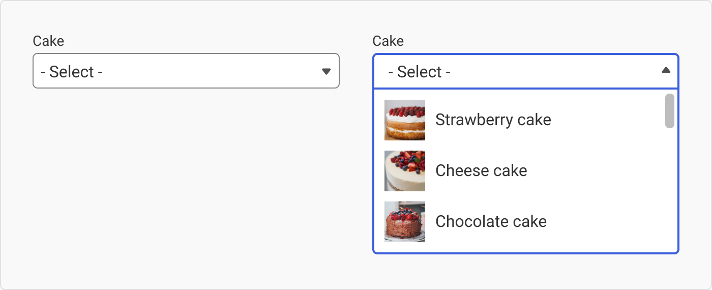
带图片的下拉菜单。照片来自 Unspalsh。照片来源草莓蛋糕 - @alinasagirova , 奶酪蛋糕 - @patuphotos, 巧克力蛋糕 - @tuvaloland
However, I am of the opinion that, due to the limited size in a dropdown, it is very difficult to see what the images are (see above graphic) so it usually isn’t worth the effort unless you make the images really big.
不过,我认为,由于下拉菜单的尺寸有限,很难看清图片的内容(见上图),所以除非把图片做得很大,否则通常不值得这么做。
Material Design’s filled dropdowns
Material Design 的填充式下拉菜单
Readers of the cheat sheet series will know that I am a big fan of Material Design, including their dropdowns.
小抄系列的读者都知道,我是 Material Design(包括其下拉菜单)的忠实粉丝。
The ‘line only’ field is no longer in use in the Material Design guidelines, but you will still see it lurking around the internet. If you want to learn more, I wrote about this in the previous cheat sheet and Dave Chui replied here.
在 Material Design 指南中,"仅线条 "字段已不再使用,但你仍然可以在互联网上看到它的身影。如果你想了解更多,我在之前的小抄中写到过这个问题,Dave Chui 也在这里做了回复。
Material Design 的线条下拉菜单
The ‘line only’ field was replaced with the ‘filled dropdown’ and it seems to be doing better in user testing. Not as cool, but much more user-friendly – and that’s what it is all about, folks.
只限行 "字段已被 "已填充下拉菜单 "所取代,在用户测试中似乎效果更好。虽然没有那么酷,但更方便用户使用--这就是它的意义所在,各位。
Material Design 的填充下拉菜单
Material Design’s outlined dropdowns
Material Design 的概述下拉菜单
Like their outlined text fields, Material Design’s outlined dropdowns are super cool. Their menu is detached from the actual dropdown container which can help with some usability issues.
与勾勒出的文本字段一样,Material Design 的勾勒出的下拉菜单也非常酷。它们的菜单与实际的下拉容器是分离的,这有助于解决一些可用性问题。
I am sure you all would have seen this sexy little animation where on-focus the label gets smaller at the top of the input . I would also like to point out something that often gets overlooked (by me): If you look at the actual dropdown, you will notice that the first item is blank. This is so that the user can ‘reset’ the dropdown if they want to come back to that question later or to leave it blank.
我相信大家都看过这个性感的小动画,在对焦时,输入顶部的标签会变小。我还想指出一些经常被(我)忽略的地方:如果查看实际的下拉菜单,你会发现第一个项目是空白的。这样用户就可以 "重置 "下拉菜单,以便日后再返回该问题或将其留空。
Material Design 的概述下拉菜单
4. Dropdown states 4.下拉状态
When a user interacts with an input of any sort, the input should switch states or appearances to give the user feedback. Here we will be looking at the different states of dropdowns.
当用户与任何类型的输入进行交互时,输入都应切换状态或外观,以便向用户提供反馈。下面我们将介绍下拉菜单的不同状态。
Active state 活动状态
The active state is what the dropdown will look like before the user has interacted with it.
活动状态是下拉菜单在用户与之交互之前的样子。

Disabled 残疾
If you disable an input field, users won’t be able to interact with it but they will be able to see it. You may use this if your business rules require it, but that probably won’t be very often.
如果禁用输入字段,用户将无法与之交互,但可以看到它。如果业务规则需要,您可以使用这种方法,但这种情况可能不会经常发生。

Hover 悬停
If the user hovers over a dropdown, it should indicate that it is clickable.
如果用户将鼠标悬停在下拉菜单上,则应显示可点击。

N00b tip: You can’t hover on touch devices, so don’t design states for these if you are designing for mobile or tablet apps.
新手提示:在触摸设备上无法悬停,所以如果你是为手机或平板电脑设计应用程序,就不要为这些设备设计状态。
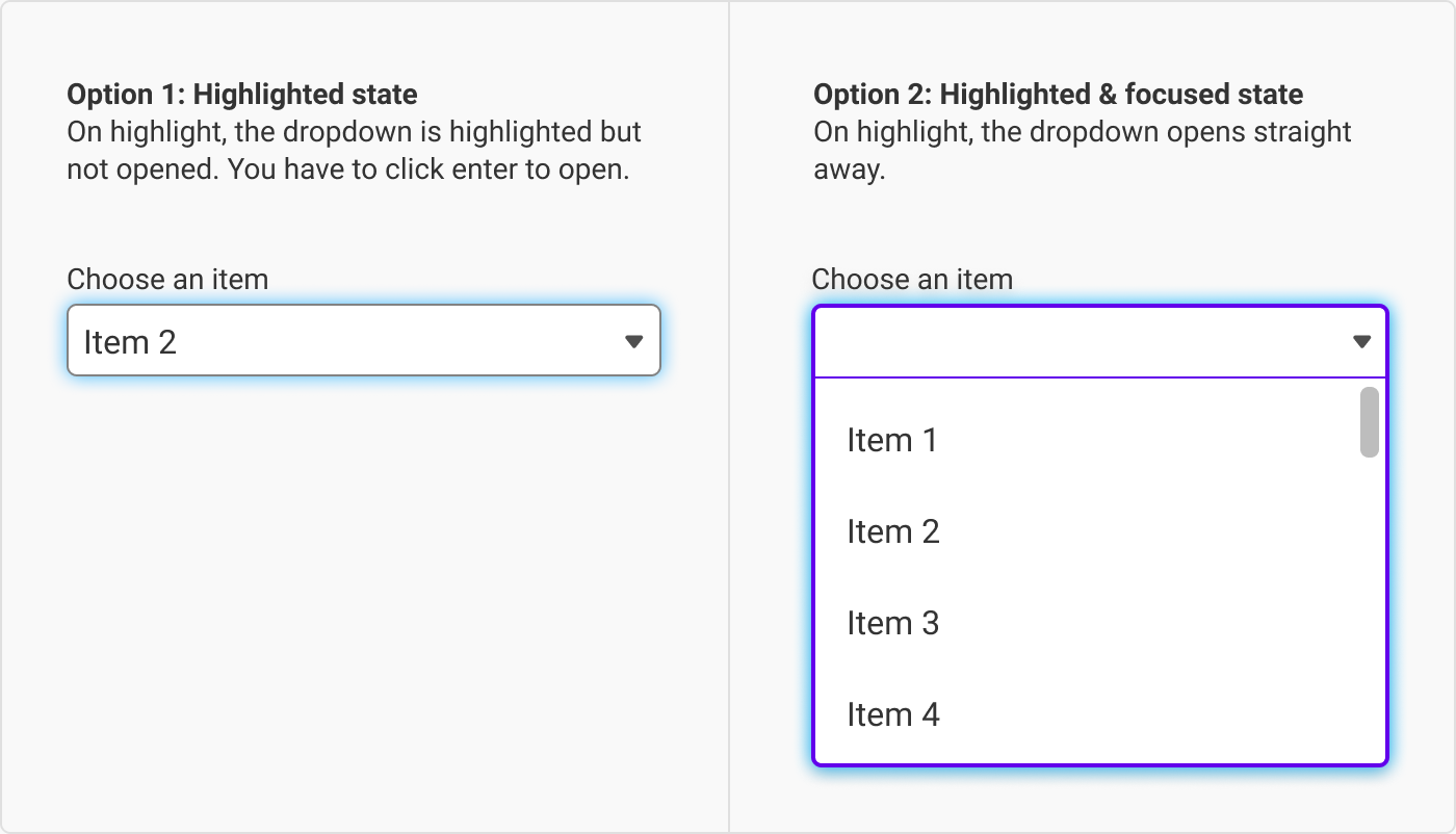
Highlight state 突出状态
The highlighted state is when a user is using a tabbing map (this is when a user uses ‘tab’ to navigate an interface and ‘enter’ to input information) and highlights the dropdown before selecting it. We typically see this as the ‘blue halo’ on clickable items.
高亮状态是指用户在使用制表图时(这是指用户使用 "制表符 "浏览界面,使用 "回车键 "输入信息),在选择下拉菜单前将其高亮显示。我们通常将其视为可点击项目上的 "蓝色光晕"。
However, some sites combine the highlight and focus state so that even if the user doesn’t click ‘enter’, the dropdown opens straight away. I am torn as to what is the best system. Logically, combining the two states makes sense; however, I get so confused when dropdowns open without me explicitly telling them to. Has anyone else had experience with this? Let me know in the comments.
不过,有些网站会将高亮和焦点状态结合起来,这样即使用户不点击 "回车",下拉菜单也会直接打开。我很纠结什么是最好的系统。从逻辑上讲,将两种状态结合在一起是合理的;但是,如果下拉菜单在我没有明确指示的情况下打开,我就会感到非常困惑。其他人有这方面的经验吗?请在评论中告诉我。
突出显示的备选状态
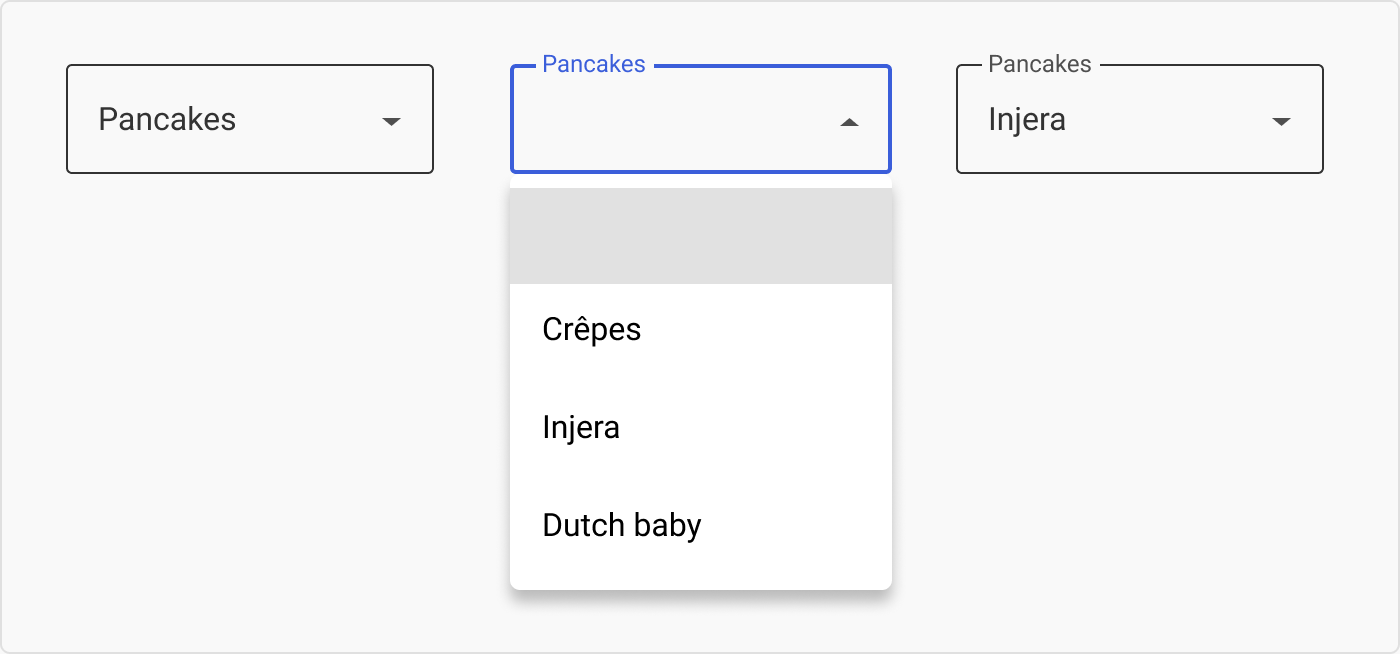
Focus state 聚焦状态
Focus state is when the item is interactable. Once you have clicked on the dropdown, it will open up a menu and display its options.
焦点状态是指项目可交互的状态。点击下拉菜单后,它将打开一个菜单并显示其选项。
While a lot of the drops downs I have interacted with keep the arrow pointing in the same direction in both active and focus states, I prefer to swop the arrow’s direction. I think of them in the same way as an accordion. And if you are super cool, you can animate the arrow’s change in direction.
虽然我接触过的很多下拉菜单在活动和聚焦状态下箭头都指向同一个方向,但我更喜欢交换箭头的方向。我认为它们就像手风琴一样。如果你很酷,还可以将箭头方向的变化制作成动画。
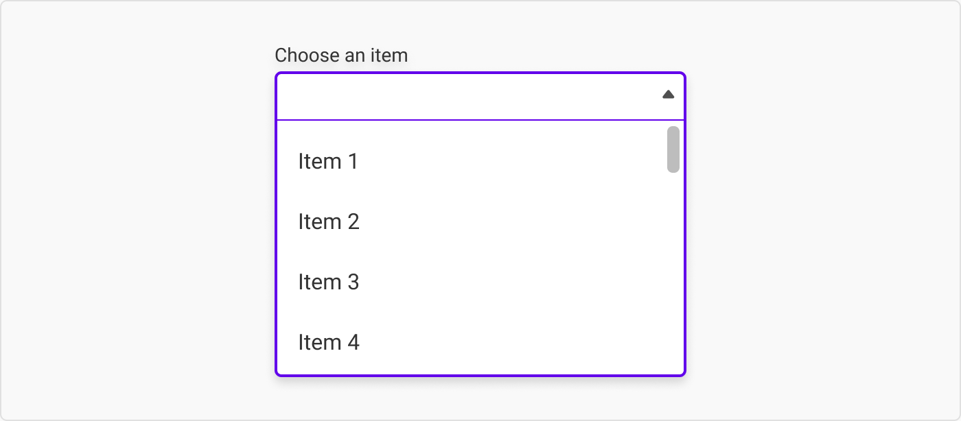
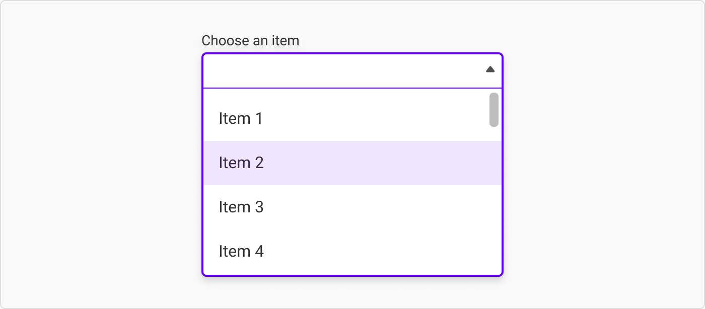
As the user hovers over the items in the menu, it should display which option is being hovered over.
当用户将鼠标悬停在菜单项上时,应显示被悬停的选项。
Completed input 已完成输入
Once the user has chosen an option, the input should snap or animate back to the active state, except it will have the chosen item displayed.
一旦用户选择了某个选项,输入法就会以快照或动画的形式返回到活动状态,只不过显示的是所选的项目。

Fail feedback 失败反馈
With free text input, it is possible for a user to make a typo, etc. However, since the options in a dropdown are predetermined, there should only be one type of fail feedback: the ‘incomplete’ type, which the user will only receive if they click the ‘submit’ button before they finished filling out the form.
在自由文本输入中,用户有可能出现错别字等情况。但是,由于下拉菜单中的选项是预先确定的,因此应该只有一种失败反馈:"未完成 "类型,只有当用户在填写表格之前点击 "提交 "按钮时才会收到这种反馈。

5. What the placeholder should say
5.占位符应说明的内容
As a general rule, I would keep the placeholder/prompt text similar to that of your free text fields. Still not sure? Here are a few options for you:
一般来说,我会让占位符/提示文本与自由文本字段相似。还不确定吗?这里有几个选择供您参考:
Leave the placeholder blank
将占位符留空
Leaving the placeholder blank is usually the easiest option if the other text fields don’t have placeholders.
如果其他文本字段没有占位符,留空占位符通常是最简单的选择。

带空白占位符的下拉列表
Have a generic prompt in the placeholder
在占位符中设置通用提示
‘- Select -’, ‘Choose’, etc. are the classic prompts to put in a dropdown.
选择-"、"选择 "等都是下拉菜单中的经典提示。
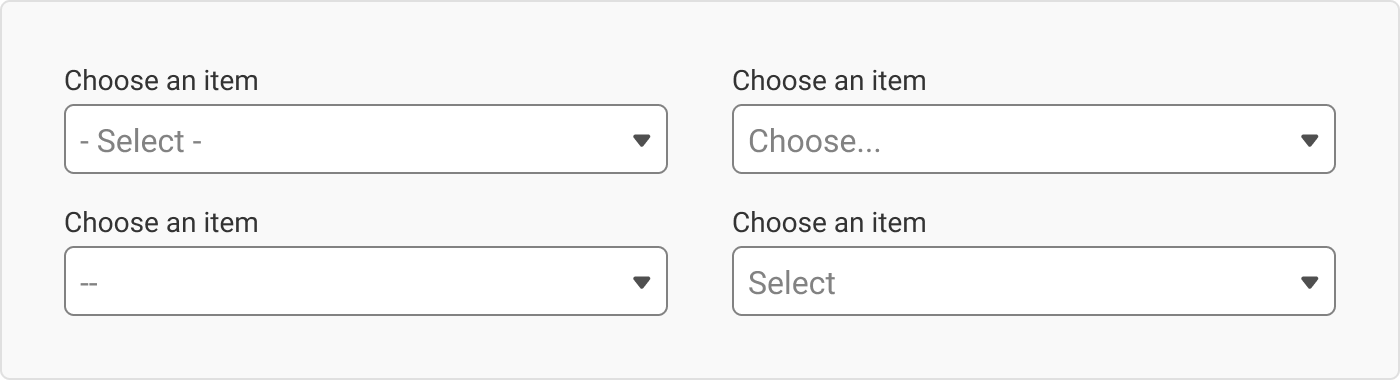
带通用提示的下拉菜单
Having a promoting phrase in the placeholder
在占位符中加入宣传短语
Using a generic ‘Select’/‘Choose’ and then the thing you want them to select is a kind of cool way to keep a level of consistency across your dropdowns but also to give your users a prompt as to what to do.
使用通用的 "选择"/"Choose",然后再选择你想让他们选择的东西,这是一种很酷的方法,既能保持下拉菜单的一致性,又能提示用户该做什么。
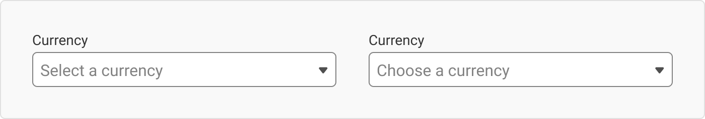
使用通用组合的下拉列表
Surface an option in the placeholder
在占位符中显示一个选项
While you have the option to surface a preselected item in a dropdown, you do have to be careful to make sure the that the user has seen and read it – otherwise they may be consenting to something they wouldn’t want to. #classicDarkPatternMove
虽然您可以选择在下拉菜单中显示预选项,但您必须小心确保用户已经看到并阅读了预选项,否则他们可能会同意一些他们不想同意的事情。#经典暗纹移动

下拉菜单中的表面选项作为占位符
So what option should you choose? When in doubt, opt for consistency. If your text fields all have placeholders, use placeholders.
那么,您应该选择哪种方案呢?如果有疑问,请选择一致性。如果您的文本字段都有占位符,那就使用占位符。
6. When not to use a dropdown (and when to)
6.何时不使用下拉菜单(何时使用)
This is dedicated to all the sites that make me input my year of birth using a dropdown: f*** you. I don’t need any more reminder of my rapidly increasing age by scrolling through a whole list of months until I eventually find the year I was born.
这是献给所有让我用下拉菜单输入出生年份的网站的:去你妈的。我不需要再通过滚动一整列月份来提醒我迅速增长的年龄,直到我最终找到我出生的年份。
If you have fewer than five options
如果选项少于五个
If you have fewer than five options, it is probably easier to use radio buttons instead of using the extra click to get to all the list options. Anything more than five options starts to take up a lot of space.
如果选项少于 5 个,使用单选按钮可能会更方便,而不需要额外点击来查看所有列表选项。超过五个选项就会占用大量空间。
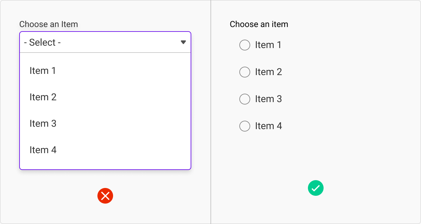
下拉式替代方案:如果选项少于五个
Note: Some people say that the rule should be fewer than six, not fewer than five, but I, but I will let you be the judge of that.
注:有人说,规则应该是少于 6 个,而不是少于 5 个,但我,还是让你们来判断吧。
If it would be easier to type than to select
如果键入比选择更容易
If it would take your user less time to type than to select something from a dropdown, do you really have to ask which is better? For a birth date, for example, it would be easier to type the date than to use three separate dropdowns.
如果用户键入所花的时间比从下拉菜单中选择所花的时间要少,你还需要问哪个更好吗?以出生日期为例,键入日期比使用三个单独的下拉菜单更容易。
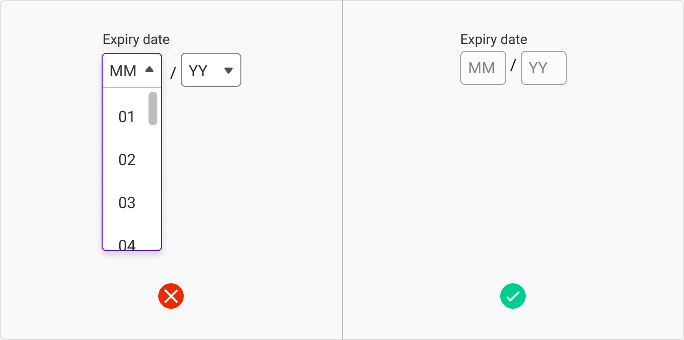
下拉选择:如果键入
Sometimes developers may argue against this, as it is easier to make a dropdown than to set up all the rules about what users can and can’t enter in free text fields. I alas, have lost this battle many times, but I continue to fight the good fight.
有时,开发人员可能会反对这样做,因为制作一个下拉菜单比设置所有关于用户可以和不可以在自由文本字段中输入什么的规则要容易得多。唉,我在这场战斗中输了很多次,但我仍在继续战斗。
If you have two options and they are ‘on’ and ‘off’ (or ‘yes’ and ‘no’)
如果您有两个选项,且分别为 "开 "和 "关"(或 "是 "和 "否"),则
Having a dropdown with two options is a bit annoying. Especially with ‘yes/no’ questions. Toggles solve this nicely for these types of questions.
有两个选项的下拉菜单有点恼人。尤其是 "是/否 "问题。对于这类问题,切换按钮可以很好地解决这个问题。
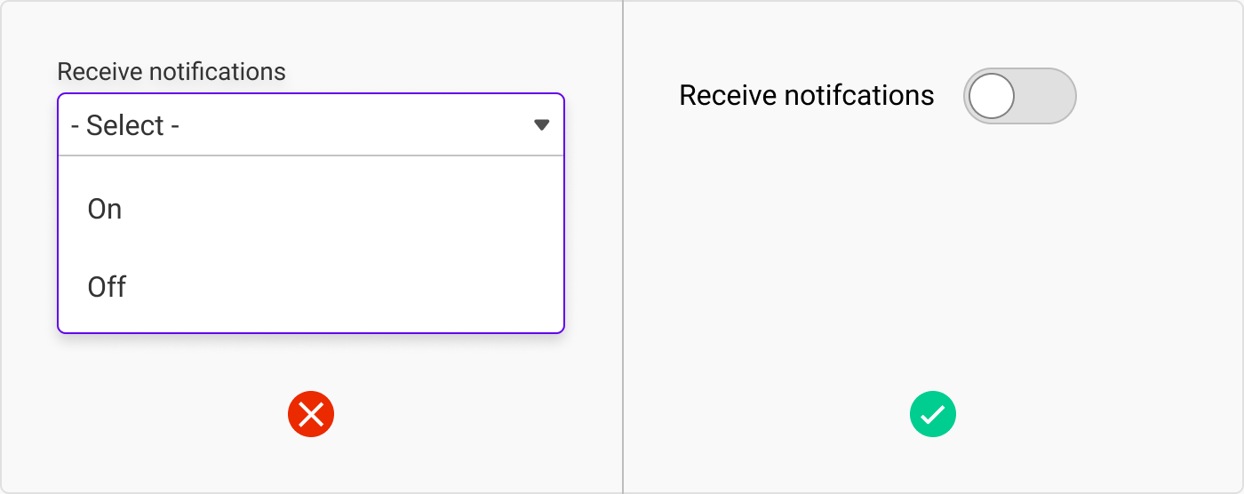
下拉式替代方案:如果您有一个双选项问题
If the options are numeric
如果选项是数字
If your options are numeric, you have a few options.
如果您的选项是数字,您有几种选择。
The first is, once again, letting them type it out. Steppers are also helpful, but I would only suggest this if the behaviour is expected to go to max five. Otherwise, your poor user will be sitting there clicking to 100.
首先,还是让他们打出来。步进器也很有帮助,但我只建议在预期行为达到最大值 5 时使用步进器。否则,你可怜的用户就会坐在那里点击到 100。

下拉式替代方案:如果选项是数字
The second is using a slider to select the value. Sliders are especially helpful for larger numbers or approximations.
第二种是使用滑块选择数值。滑块对于较大的数字或近似值尤其有用。
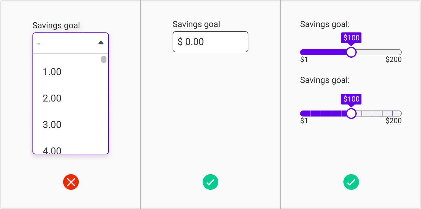
下拉式替代方案:如果选项是数字
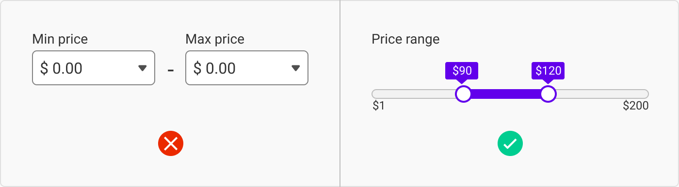
下拉式替代方案:如果选项是一个范围
If there are a lot of options
如果有很多选择
If there are a lot of options in a dropdown (which you should avoid if possible), let the user ‘search’ for their option. The most common time to see this type of behaviour is with country dropdowns, as they are vast but also easy to answer. As mentioned earlier, this is best paired with an autocomplete.
如果下拉菜单中有很多选项(应尽可能避免),应让用户 "搜索 "其选项。这种行为最常见于国家/地区下拉菜单,因为这些下拉菜单内容繁多,但也很容易回答。如前所述,最好与自动完成功能搭配使用。
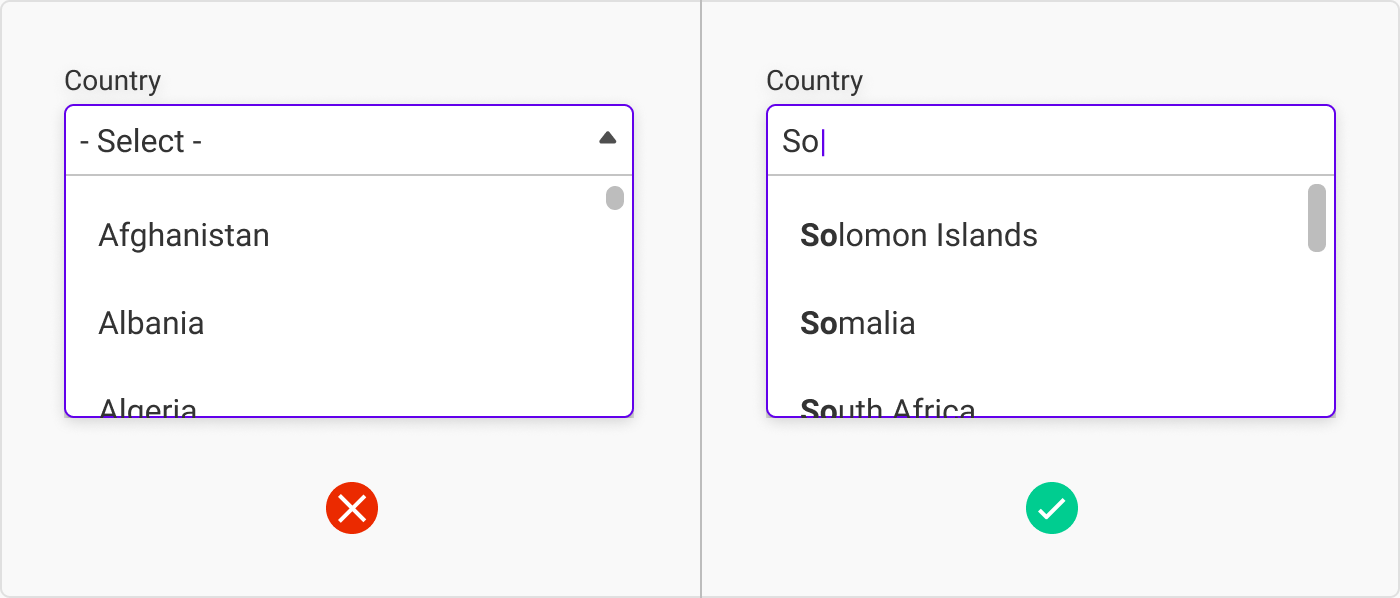
下拉菜单替代方案:如果有很多选项,但用户在点击下拉菜单之前已经知道了答案
So, when should you use a dropdown?
那么,什么时候应该使用下拉菜单呢?
An input needs to meet two requirements for me to consider using a dropdown:
输入必须满足两个条件,我才会考虑使用下拉菜单:
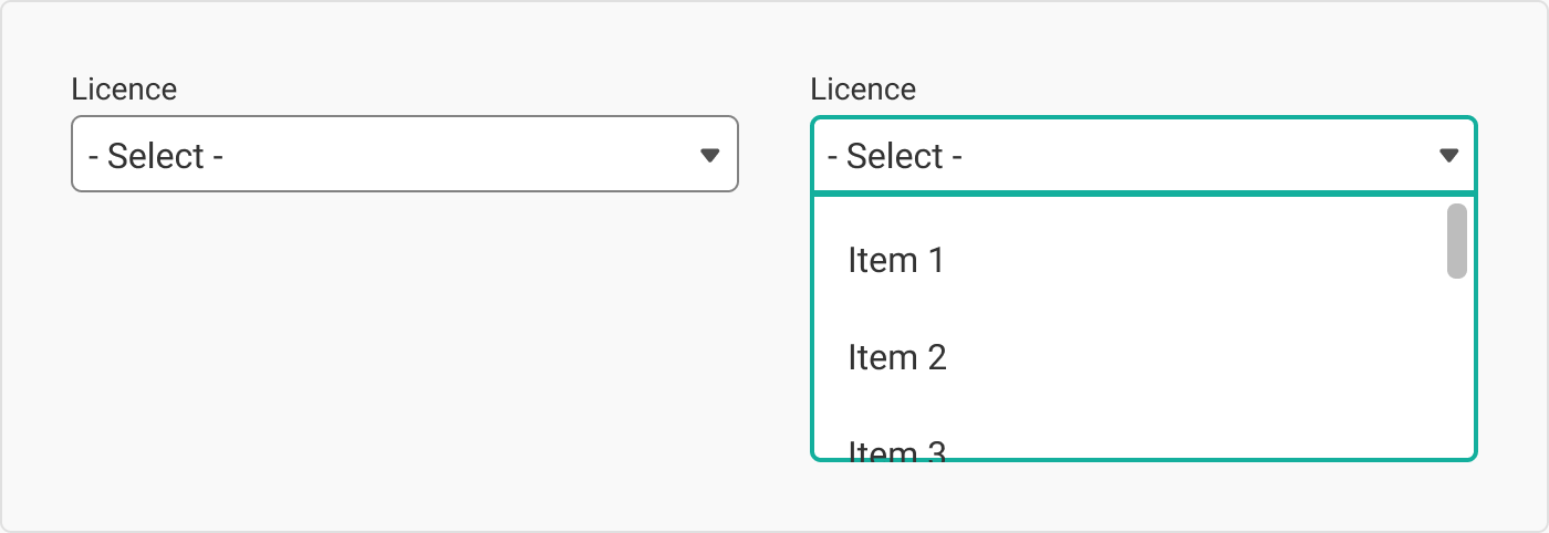
- There are more than six options.
选项不止六个。 - When the options aren’t something that a user would know straight away. For example, imagine your user was uploading a video and the host needed to know what kind of licence to attach to the video. An average user wouldn’t know all the options available on the platform, making a dropdown necessary.
当选项不是用户马上就能知道的时候。例如,假设用户正在上传视频,而主机需要知道视频应附带何种许可证。普通用户不会知道平台上的所有选项,因此有必要使用下拉菜单。
7. Native dropdowns 7.本地下拉菜单
We tend to use native or default options when time and budget is tight or when we are working on an MVP. Having custom inputs are the frosting on the cake, but sometimes we don’t have the option to make that sweet, sweet icing. In that instance, it is good to know what you have to work with.
当时间和预算紧张或正在开发 MVP 时,我们倾向于使用本地或默认选项。自定义输入是蛋糕上的糖霜,但有时我们无法选择制作甜美的糖霜。在这种情况下,了解自己的工作情况是很有必要的。
Native dropdowns are just safer as well when it comes to usability across different devices.
就不同设备的可用性而言,本地下拉菜单也更安全。
Our large-scale checkout usability testing and benchmarking reveal that while 82% of e-commerce sites use custom designed drop-downs in the checkout flow, 31% of all custom designed drop-downs have significant usability issues.
我们的大规模结账可用性测试和基准测试显示,虽然 82% 的电子商务网站在结账流程中使用定制设计的下拉菜单,但所有定制设计的下拉菜单中有 31% 存在严重的可用性问题。
- Christian Holst, view story here
- 克里斯蒂安-霍尔斯特,点击此处查看报道
The defaults 默认值
Here are some examples of native dropdowns in the wild. To try for yourself, go here: https://html.com/attributes/option-selected/
下面是一些原生下拉菜单的示例。要亲自尝试,请访问此处: https://html.com/attributes/option-selected/
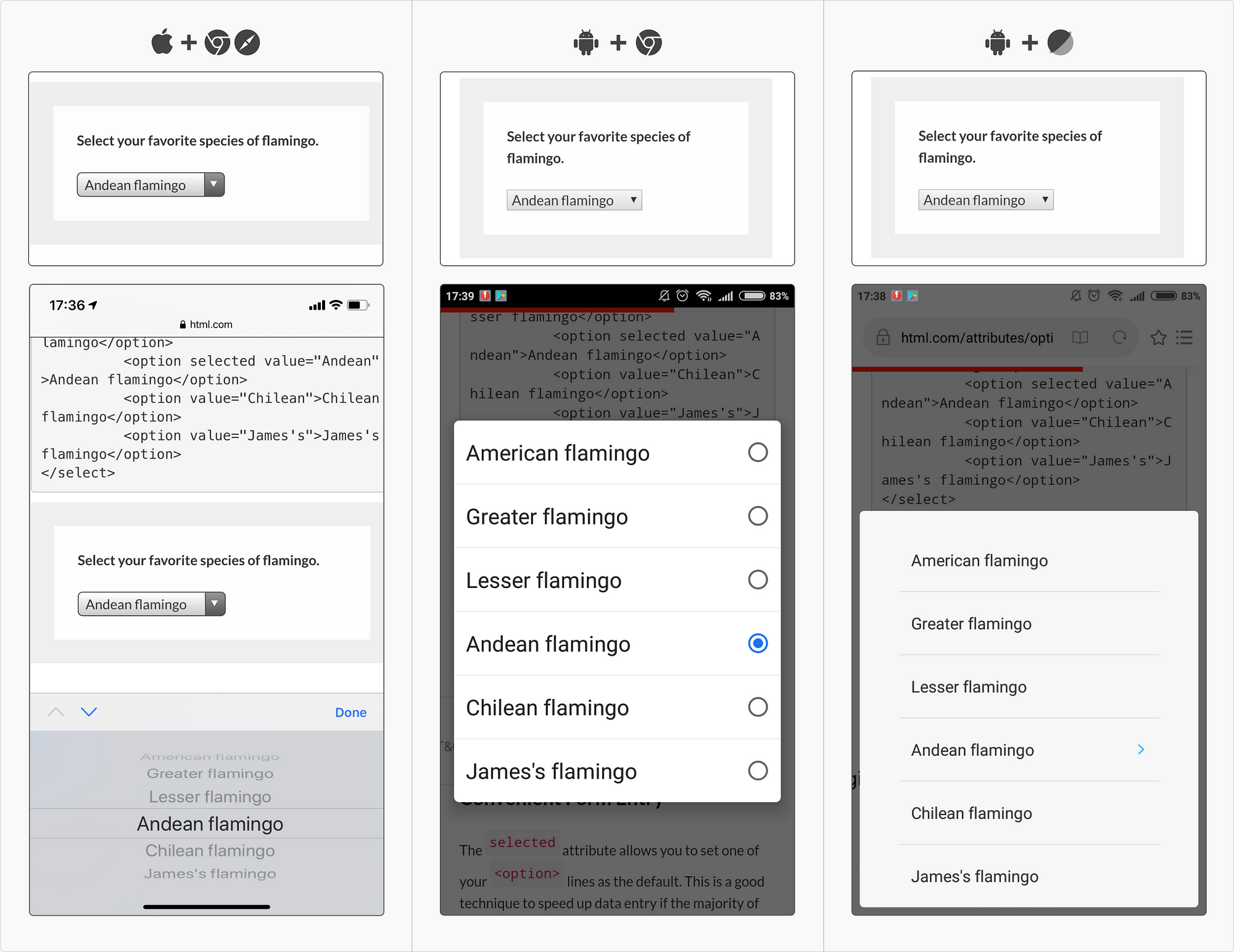
本地移动下拉菜单 | https://html.com/attributes/option-selected/
本地桌面下拉菜单 https://html.com/attributes/option-selected/
As you can see in these examples, they are all slightly different depending on their platform and browser. They aren’t pretty, but they are very usable.
从这些示例中可以看出,根据平台和浏览器的不同,它们都略有不同。它们并不漂亮,但非常实用。
Using a shell 使用外壳
I used to call this ‘semi-custom’, but I recently found an article that called this pattern a shell – and that sounds far more official. So I vow to henceforth call it a shell, and I also vow to use it in meetings and bask in the power of people asking me what it means, just so that I can show off how clever I am.
我以前称它为 "半定制",但最近我发现一篇文章称这种图案为 "贝壳"--这听起来要正式得多。因此,我发誓从今以后就叫它 "壳",我还发誓要在会议上使用它,并沉浸在人们问我这是什么意思的喜悦中,这样我就可以炫耀自己有多聪明了。
‘BUT what is a shell?’, you ask. A shell is when a field looks custom, but when you click it, it uses the native dropdown styling. This is a simple way of keeping the style of the page looking consistent with your brand and lowering dev cost. It also helps with all the UX issues that come with custom fields.
你会问 "但什么是外壳?外壳是指一个字段看起来是自定义的,但当你点击它时,它会使用原生的下拉样式。这是一种保持页面风格与品牌一致并降低开发成本的简单方法。它还有助于解决自定义字段带来的所有用户体验问题。
8. Accessibility checklist
8.无障碍清单
- Is the active state of the dropdown (label included) more than 44px? (We include the label in this because if you click the label, the dropdown should still open.)
下拉菜单(包括标签)的活动状态是否大于 44px? 我们之所以将标签包括在内,是因为如果点击标签,下拉菜单仍应打开)。 - Is each line item in the dropdown menu more than 44px high with 8px in between?
下拉菜单中每一行的高度是否超过 44px,中间间隔 8px? - Do the colours meet the AAA compliance standards?
颜色是否符合 AAA 合规标准? - Does your dropdown have a highlighted state?
您的下拉菜单是否有高亮状态? - Make sure that the dropdowns work on a tabbing map.
确保下拉菜单可在制表图上使用。 - If you do use a custom dropdown, make sure that it can open up or down in the instance that the browser viewport is too low down.
如果使用自定义下拉菜单,请确保在浏览器视口过低的情况下,它可以向上或向下打开。
And, when in doubt, go visit https://webaim.org/techniques/forms/controls
如有疑问,请访问 https://webaim.org/techniques/forms/controls
 As 由于 my usual reader will know, it’s been a while since I have written one of these, and I am sorry it has taken so long. But, by golly, it’s good to back. And, you know, there’s nothing like a global pandemic to get you back to writing.
我的老读者都知道,我已经有一段时间没有写这篇文章了,很抱歉花了这么长时间。不过,天哪,回来真好。而且,你知道,没有什么比一场全球大流行更能让你重拾写作的热情了。
Dropdowns get a lot of hate – and rightly so. But sometimes there are few feasible alternatives, and, if that is the case, you should make your ugly little dropdowns the best that they could possibly be.
下拉菜单受到很多人的讨厌,这也是理所当然的。但有时几乎没有可行的替代方案,如果是这种情况,你就应该把丑陋的小下拉菜单做到最好。