
iOS 17 Design iOS 17设计
Add to favorites 添加到收藏夹
Understand the fundamental design elements to help you create rich experiences for iOS 17 and vision OS
了解基本设计元素,帮助您为iOS 17和vision OS打造丰富体验
Play video 玩电子
Design and Prototype for iOS 17 in Figma
FIGMA中IOS 17的设计与原型
5%
1
iOS 17 Design iOS 17设计
22:22
2
UI Kit UI套件
23:00
3
Wireframing 线框图
14:03
4
AI Images with Midjourney
使用Midjourney的AI图像
13:16
5
Colors and Gradients 颜色和渐变
20:38
6
iOS 17 Typography iOS 17排版
16:14
7
SF Symbols 5 SF符号5
16:30
8
Spatial Design Principles
空间设计原则
9:36
9
visionOS UI Components visionOS UI组件
15:28
10
visionOS Materials and Typography
visionOS材料和排版
17:09
11
visionOS SF Symbols and App Icons
visionOS SF符号和应用图标
6:46
12
Figma Variables Figma变量
14:40
13
Advanced Prototyping with Variables
使用变量的高级原型
17:47
14
Travel App Structure 旅行应用程序结构
14:01
15
Typography and Icons 排版和图标
14:54
16
New Auto Layout 新建自动布局
16:33
17
Colors and Gradients 颜色和渐变
17:29
18
Images and Tab Bar 图像和选项卡栏
12:24
19
Icon and Cards Animation 图标和卡片动画
15:00
20
Tab Bar and Scrolling Content
标签栏和滚动内容
10:48
21
Button Interactions and Transitions
按钮交互和转换
20:21
Welcome to our course on Design and Prototype for iOS 17 in Figma! iOS 17 brings many exciting features and improvements, and we will explore how to exploit them to create remarkable app experiences. You will learn fundamental design principles, guidelines, and practical techniques for crafting visually appealing and user-friendly interfaces. Additionally, we will cover visionOS and learn how to create a spatial design concept that allows you to create comfortable, human-centred experiences using depth, scale, windows, and immersion. Moreover, we will explore the exciting new features in Figma, such as Dev Mode, variables, advanced prototyping, and auto layout updates.
欢迎来到Figma的iOS 17设计和原型课程!iOS 17带来了许多令人兴奋的功能和改进,我们将探讨如何利用它们来创建卓越的应用体验。您将学习基本的设计原则,指导方针和实用技术,用于制作视觉上吸引人和用户友好的界面。此外,我们将介绍visionOS,并学习如何创建一个空间设计概念,让您使用深度,比例,窗口和沉浸感来创建舒适,以人为本的体验。此外,我们将探索Figma中令人兴奋的新功能,例如开发模式,变量,高级原型设计和自动布局更新。
Figma File Figma文件
iOS 17 + iPadOS 17 Design Kit
iOS 17 + iPadOS 17设计套件
Apple has taken a significant step towards empowering designers by releasing its first official design kit Apple Design Resources for Figma. This comprehensive kit encompasses a wide range of essential components, views, system interfaces, text styles, color styles, materials, and layout guides. With this kit at their disposal, designers can now swiftly create highly realistic iOS and iPadOS app designs that align seamlessly with Apple's design principles.
苹果公司通过发布其首个官方设计工具包Apple Design Resources for Figma,朝着赋予设计师权力迈出了重要一步。这一全面的工具包包括广泛的基本组件、视图、系统界面、文本样式、颜色样式、材质和布局指南。有了这个工具包,设计师现在可以快速创建高度逼真的iOS和iPadOS应用程序设计,与Apple的设计原则无缝结合。

visionOS Design Kit visionOS设计工具包
Apple has released its long-awaited design kit, Apple Design Resources - visionOS, for Figma. This extensive package is a valuable resource for designers, providing them with a variety of UI components, views, system interfaces, text styles, color styles, and materials. With these tools, designers can easily and efficiently infuse life and create stunningly realistic visionOS app designs.
苹果已经发布了期待已久的设计工具包,苹果设计资源—visionOS,为Figma。这个广泛的软件包是设计人员的宝贵资源,为他们提供了各种UI组件、视图、系统界面、文本样式、颜色样式和材质。有了这些工具,设计师可以轻松有效地注入生活,并创建令人惊叹的逼真visionOS应用程序设计。

Apple Vision Pro
Apple's first spatial computer is a pair of VR glasses that transport you into a vast 3D space. You can do everything you normally do on your iPhone, iPad, or computer, like browsing the web, chatting with friends, FaceTiming family, playing games, and watching movies. The glasses offer high pixel density more than a 4K TV, ensuring stunning visuals wherever you are. Despite being immersed in the virtual world, they provide a wide field of view, keeping you connected to your surroundings. Apple Vision Pro stands out for its absence of physical controllers, as it can be controlled through voice commands, eye tracking, and hand gestures. You can also capture amazing 3D photos and videos. Your existing library of visuals will look incredible on this remarkable platform.
苹果的第一台空间计算机是一副VR眼镜,可以将你带入广阔的3D空间。您可以在iPhone、iPad或计算机上执行您通常执行的所有操作,例如浏览网页、与朋友聊天、FaceTiming家人通话、玩游戏和观看电影。该眼镜提供比4K电视更高的像素密度,无论您身在何处,都能确保令人惊叹的视觉效果。尽管沉浸在虚拟世界中,但它们提供了广阔的视野,使您与周围环境保持联系。Apple Vision Pro的突出之处在于它没有物理控制器,因为它可以通过语音命令,眼睛跟踪和手势进行控制。您还可以拍摄惊人的3D照片和视频。您现有的视觉效果库将在这个非凡的平台上看起来令人难以置信。

visionOS visionos的
visionOS is the Apple Vision Pro operating system. We’ll learn how to design great interfaces for spatial computing apps. We'll help you use what you already know about designing screens to create amazing experiences for visionOS. You'll learn useful tips for UI elements, materials, and typography, and how to make experiences that are familiar and easy for people to use.
visionOS是Apple Vision Pro操作系统。我们将学习如何为空间计算应用程序设计出色的界面。我们将帮助您使用您已经了解的屏幕设计知识,为visionOS创造令人惊叹的体验。您将学习有关UI元素、材质和排版的有用提示,以及如何创建人们熟悉且易于使用的体验。

iOS 17
iOS 17 is the next-generation version of iOS. This update will bring exciting new features to Messages, Phones, and FaceTime. FaceTime will now be available on Apple TV and support Continuity Camera. You can customize the look for each person that calls, with the person who places the call able to customize their look. With StandBy, an iPhone placed horizontally turns into a little home hub that displays information like the calendar, time, home controls, and more and Live Activities can also be shown in full screen. Also, you have the option to create animated stickers from your Live Photos. The update will introduce a StandBy mode, interactive widgets for a more engaging experience, and mood-tracking and journaling features.
iOS 17是iOS的下一代版本。此更新将为消息、电话和FaceTime带来令人兴奋的新功能。FaceTime现在将在Apple TV上提供,并支持连续摄像头。您可以为每个呼叫者自定义外观,拨打呼叫的人可以自定义他们的外观。有了待机功能,水平放置的iPhone就变成了一个小小的家庭集线器,可以显示日历、时间、家庭控制等信息,Live Activities也可以全屏显示。此外,您还可以选择从Live Photos创建动画贴纸。更新将引入待机模式,交互式小部件,以获得更吸引人的体验,以及情绪跟踪和日志功能。

macOS Sonoma macOS索诺马
macOS Sonoma is the latest version of the Mac operating system, bringing exciting new features. You can now enjoy interactive widgets directly on your desktop, providing convenient access to helpful information. Additionally, you'll have access to iPhone widgets on your Mac, keeping you updated on the go. To protect your privacy, a locked private browsing mode has been introduced. Keeping your favourite web apps in the dock is now easier than ever for quick access. Gamers will be delighted to find a dedicated Game Mode for Apple silicon Macs, enhancing the gaming experience. Lastly, Apple TV-like screen savers have been added to add visual appeal during idle moments on your Mac.
macOS索诺马是Mac操作系统的最新版本,带来了令人兴奋的新功能。您现在可以直接在桌面上使用交互式小部件,方便地访问有用的信息。此外,您还可以在Mac上访问iPhone小部件,随时随地保持更新。为了保护您的隐私,已引入锁定的隐私浏览模式。将您最喜爱的Web应用程序保存在Dock中现在比以往任何时候都更容易快速访问。游戏玩家将很高兴为Apple硅Mac找到专用的游戏模式,以增强游戏体验。最后,苹果电视一样的屏幕保护程序已被添加到添加视觉吸引力在空闲的时刻在您的Mac上。

Evolution of iOS
Let's talk about how iOS has changed over the years, and then we’ll cover the foundations design elements for iOS 17 and visionOS. In the picture, you can see three screenshots of different iPhones. The first iPhone came out in 2007. If you look closely, you'll see that the status bar, where the time is shown, has changed. The menu bar at the bottom, where the applications are, looks very different too. It used to have a realistic design called "Skeuomorphic."

Evolution of Flat Design
Before iOS 7, flat design wasn't as common as it is now. When flat design was introduced, it had a big impact on the design world. But it's important to know that flat design has evolved to fit larger screens. At first, it was a big change from the realistic designs that were popular before. But as time went on, flat design became more refined and detailed. This evolution has brought a more consistent design style across different platforms. Now, it has simpler layouts, focuses more on the content, and improves visual clarity using techniques like blur sheets, gradients, and drop shadows.

Designing for iOS and visionOS
The design for iOS 17 stays the same, following the existing guidelines. The design will be mostly similar to iOS 16, with flat elements, background blur, neutral gradients, subtle drop shadows, rounded corners, and large, bold titles. However, there are important updates in Apple's interface guidelines for visionOS, which we'll explore thoroughly. We'll discuss various topics like designing for visionOS, spatial layout, immersive experiences, and more. These subjects will be extensively covered in the design for visionOS section.
Large Titles
Bold fonts have become more common, with titles appearing large and bold. This change is because screens are now taller than before, so it makes sense to have larger titles. Accessibility is another important reason for using large fonts. Since billions of people of all ages use their phones daily, ensuring the content is clear and easy to read is crucial. In iOS, users can set very large fonts for apps that support accessibility, including all of Apple's built-in apps. This has become an expected feature for users.

Cards
With larger screens, there's more room to showcase content. In the past, it made sense to remove any unnecessary elements and prioritize content. However, things have changed with the introduction of iPhone X and 8. Now, we can enhance navigation by including status, navigation, and tab bars. Additionally, using cards can help organize different sections more effectively. Rounded corners on these cards give them a tactile and friendly feel. To add depth and context to your design, you can incorporate blurred backgrounds and drop shadows. These techniques create a sense of depth and make your content more engaging.

Colors
Now, let's talk about color. Use a noticeable color to show that an element can be tapped or highlighted. Choosing the right colors and neutral tones is important for your design to succeed. For buttons and states, blue is a dependable and safe option. It's also a good idea to start with a light background and black text, or if your design is in dark mode, go for a dark background with white text. This combination creates strong contrast and makes the text easy to read.

Primary Color
Simplify your user interface to its essential aesthetics. When you consider adding an element, ask yourself if it's necessary. Avoid using heavy textures, 3D effects, and multiple shadows excessively unless your app is a game or has a specific theme. Instead, prioritize functional colors, cohesive gradients, and attractive typography to create a visually pleasing design.

iOS Palette
Here is the iOS palette colour for light and dark modes. Apple employs specific colours in their native apps. Blue is the most commonly used colour across the system, representing buttons, icons, and actionable elements. However, other colours are utilized to establish brand identity, such as yellow for Notes, pink for Apple Music, and green for Messages. When in doubt, it's advisable to opt for blue. During the design process, it's important to remember that red is typically associated with destructive actions, while green signifies successful actions.

Meaning in colors
Colors carry meaning and it's important to use them wisely. Red, green, blue, and neutral tones each have their own significance. Red is commonly associated with destructive actions, green represents affirmative actions, blue is used for links, and neutral tones indicate inactive states. It's crucial to avoid confusing users by assigning different meanings to these colors. For instance, using green on a button that implies "Delete" would be misleading.

Gradients
A color gradient is a gradual change from one color to another, and it can include multiple shades. Gradients are also called color transitions. They can smoothly blend similar colors or create a contrast between very different ones. Different types of gradients can be chosen: linear , radial , angular, and diamond . Each type provides distinct ways to add gradient effects to your design.

Buttons
The buttons should be easy to tap and have sizes ranging from 30 to 60 points wide. It's also essential to leave sufficient space around the buttons. This helps users see and distinguish them from other screen elements, making it easy to select or activate them regardless of how they interact with the device. In standard iOS interfaces, buttons are generally recommended to be at least 44x44 points in size. iOS and ipadOS have four button styles, each available in three sizes. Each combination of size and style has a different level of visual prominence.
 💡 Additionally, each button should clearly convey its purpose. This can be achieved by using a text label, a symbol, or a combination of both.
visionOS Button
In visionOS, with its enhanced capabilities, the recommended size increases to 60x60 points . These dimensions ensure that users can effortlessly select buttons using their fingers, a pointer, their eyes, or a remote control. visionOS offers buttons in different sizes, depending on their shape and what they contain. A visionOS button usually has a visible background to help people see it, and it also produces sound to give feedback when people interact with it.

Circular or Pill-Shape Buttons
Usually, it's better to use circular or pill-shaped buttons. People tend to look towards a shape's corners, making it hard to keep their attention on the center. The more rounded a button is, the easier it is for people to focus on it. If you need to show a button on its own, using a pill-shaped button is preferable.

Button’s background for visionOS
It's better to use buttons with a noticeable background shape and fill. People find it easier to see a button when enclosed in a shape with a contrasting background fill. However, there are some exceptions. For example, if a button is placed in a toolbar, context menu, alert, or ornament, where the larger component already provides visibility, it may not need a contrasting shape and fill. You can follow these guidelines to ensure that a button looks good in different situations.
- When a button is displayed on top of a glass window, use a light material for the button's background.
- When a button floats in space, use the glass material for its background.
 💡 You will find the materials in the Apple Design Resources.
 💡 You will find the materials in the Apple Design Resources.
Layout Design
Now let's talk about Layout design which is the process of arranging visual and textual elements on-screen to grab a reader's attention and communicate information in a visually appealing way. Designers often follow principles such as alignment, visual hierarchy, and spacing when creating a compelling layout. These principles ensure a distinct and impactful design. The designer will use these standard design elements such as text, image, and shape for the layout and line for the separator.

Spatial Layout
When designing a visionOS layout, it's essential to consider certain principles: depth, scale, windows, and immersion. These principles are crucial in creating apps and games for a spatial operating system. Depth and scale are potent tools for establishing a hierarchy and highlighting content. Utilize depth to direct user focus and foster a feeling of immersion. You can enhance the user experience without causing distractions or unrealistic elements by using subtle depth and appropriate scaling.

Windows
In visionOS, windows have a similar look to those in other platforms, but with some key differences. The system displays window controls just outside a window’s bounds such as the tab bar and the share menu are placed next to or below the window. By default, a window is sized at 1306 x 734 points.

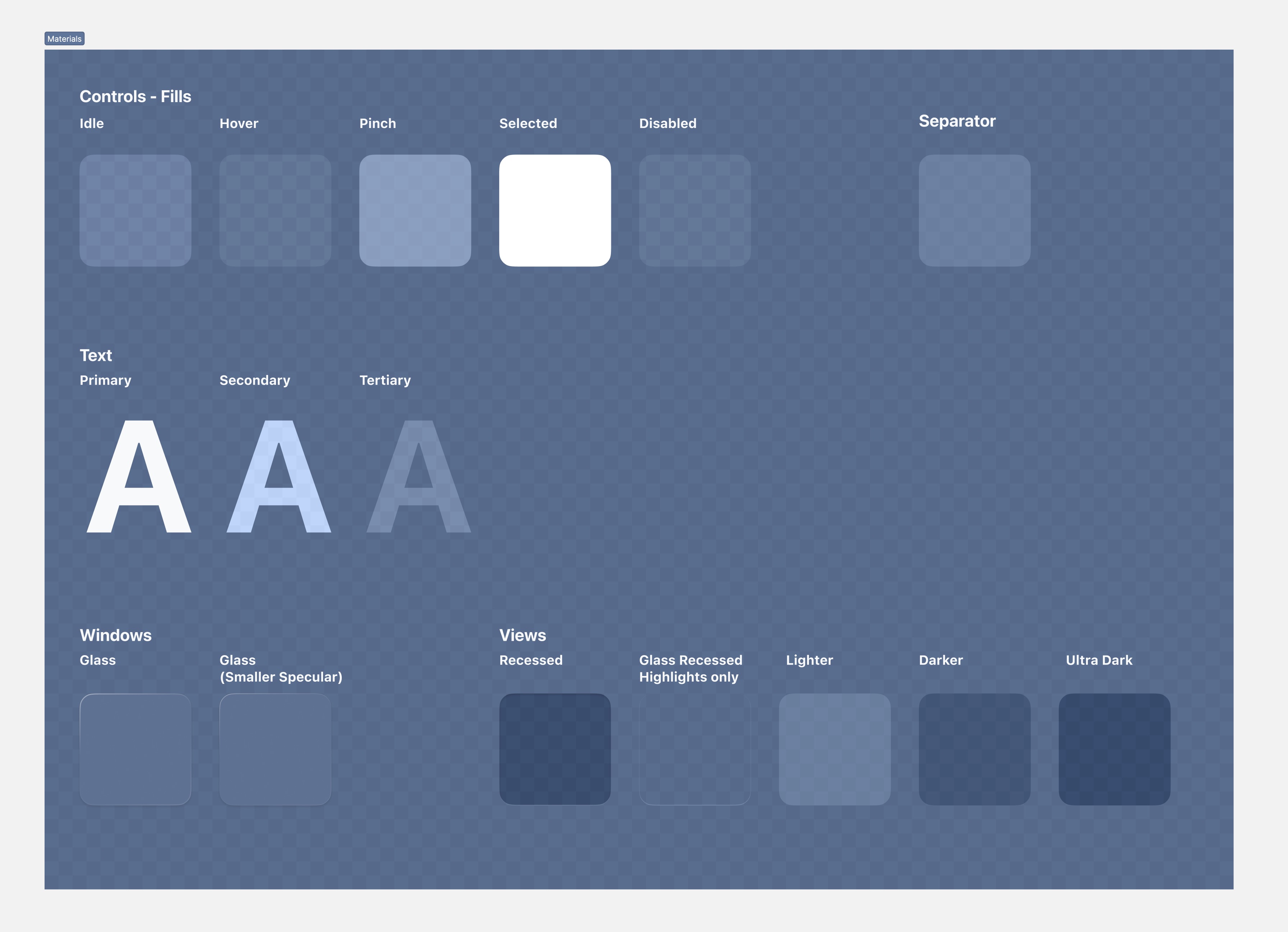
Glass Material
Windows use a special unchangeable background material called glass, which allows light and both physical and virtual objects to be visible through the window. This glass material helps blend your content seamlessly with the user's surroundings.

Ornaments
If you need to include extra controls that don't belong directly inside a window, you can use an ornament. An ornament allows you to provide app controls that are visually connected to a window without getting in the way of the system-provided controls. For example, a window's toolbar and tab bar are considered ornaments. The ornament appears to float in a plane that is parallel to the window and they can include various user interface elements like buttons, segmented controls, and other views.

Margin and Safe Area
Use negative space to draw attention to the content. Less visual clutter lets you focus on a few important elements simultaneously. Negative spacing creates breathing room, preventing your screen from being crowded with unnecessary elements. Apple typically uses margins between 16 and 20 pt. The safe area defines the area within a view that isn’t covered by a navigation bar, tab bar, toolbar, or other views a view controller might provide.

Navigation
Now, let’s talk about navigation, which is crucial because it directly impacts the user experience and usability of the app. Well-designed navigation ensures that users can easily find their way around the app. It reduces confusion and frustration, allowing users to access the desired content or perform tasks quickly.
Navigation bars
The navigation bar is at the top of the screen and often contains a title or logo and navigation buttons such as a back button or menu button. It helps users navigate back to previous screens or access additional options. It’s the same principle for visionOS, the navigation bar is at the top. Also, visionOS uses a variable blur in the bar background. The variable blur anchors the bar above the scrolling content while keeping the view’s glass material uniform and undivided.

Tab Bar
A tab bar is a row of tabs typically placed at the bottom of the screen, allowing users to switch between different sections or views with a single tap. Each tab represents a specific category or functionality. To make it easy for users to navigate your app, it's best to use as few tabs as possible. In iOS, it's recommended to have up to five tabs, and in visionOS, iPadOS, and tvOS, you can have up to six tabs. It's also important to use short and clear titles for each tab.

Tab Bar in vision OS
In visionOS, the tab bar is always vertical and stays in a fixed position on the window's side. When you see the tab bar, it expands automatically. To open a particular tab, you focus on it and tap it. However, when the tab bar is expanded, it may cover up some of the content behind it temporarily. Each tab always shows its symbol in the tab bar. The system displays the tab titles when you look at the tab bar. It's important to keep the tab titles short so that people can easily read them with a quick glance. The maximum size for a tab is 200 by 68.

Sidebar
A sidebar is a panel next to the main content area, vertically or horizontally. It offers extra navigation, options, or additional information to enhance the user experience in an app or website. Usually, a sidebar shows a list of sections, categories, or menu items that enable users to access various parts or features of the app or website.

Obvious Icons
Icons should be clear and easy to understand. Use text whenever possible to make their meaning even clearer. Avoid using different versions of the same icon in different places, as it can confuse users.

SF Symbols 5
We’re going to use icons from the SF Symbols which is a collection of more than 5,000 icons made to work perfectly with San Francisco, the font used in Apple platforms. These icons come in nine different thicknesses and three sizes, and they align automatically with text. You can export and modify them using programs that edit vector graphics, allowing you to create your own unique symbols that maintain the same design style and accessibility features. In SF Symbols 5, there are exciting new animated icons, over 700 additional symbols, and improved tools for creating customized icons.

Symbol Animations
With Animation, you can choose from a collection of configurable presets, each with unique characteristics. These presets work on all symbols, in all scales, and all rendering modes, providing unprecedented customization options.

Typography
Typography is essential for clear and visually pleasing communication. It's about more than just fancy fonts. With a simple interface and focus on content, your typography will occupy a large part of the screen, varying from 50% to 90%. So, it's important to choose an appealing font and adjust its weight, line-height, and color for visual appeal and easy reading at any size. The default San Francisco font is recommended as it was designed by Apple for legibility and is consistently used in their apps.

Font Size
Body text should be a minimum of 17 pt. Headlines should be between 17 pt and 34 pt. Subheadings are recommended to be within the font size range of 15 pt to 17 pt. Navigation bar and button titles should be sized between 15 pt and 17 pt, while tab bar items should be 11 pt.

Line Height
It's also important to consider the line height, or the spacing between lines of text. A good line height can improve readability and reduce eye strain. A general guideline is to use a line height of 1.5 times the font size, but this can also vary depending on the font and layout.

Line Length
Line length is crucial in typography, affecting how easily text is read. It refers to the width of the text block or characters per line. If too short, the text becomes disjointed and difficult to follow. If too long, readers may lose their place and experience eye fatigue. Optimal line length depends on typeface, font size, and leading. Generally, 45-75 characters per line are best for most typefaces and sizes. Larger fonts or display types may need shorter lines for readability.

Contrast
To make text easy to read, it's important to have enough contrast between the font and the background. Using black or white colors is usually a safe option as they create strong contrast with most color schemes.

Midjourney
Midjourney is perfect for generating beautiful concepts and inspirations for your designs and app icons. It is an AI platform that makes it easy for anyone to create high-quality digital content and helps bring ideas to life with stunning images and more. The platform utilizes advanced technology and powerful AI algorithms to simplify the content creation process.

Repair Tool and Upscale
To fix visual inconsistencies, use Pixelmator ’s repair tool or Photoshop’s content-aware fill , and upscale the image to 2x .

Beautiful square iOS icon. Concept store front. Flat render. Subtle gradients, no letters --v 4 --q 2

A square iphone app icon featuring top down perspective of a cafe interior. 3d. minimalistic. cute --q 2

Design a 1024×1024 square iOS app icon featuring a majestic camera, using a flat design style similar to the icons in the iOS 14 app store --q 2 --v 5.1
visionOS App Icon
App icon for visionOS differs from the iOS one, which is circular instead of square. Also, it includes a background layer and one or two layers on top, producing a three-dimensional object that subtly expands when people view it.

Figma New Feature
We're going to take a look at Figma's new features: Dev Mode, variable, advanced prototype and an update on auto layout.
Dev Mode
Design and development are now seamlessly connected through Dev Mode. Dev Mode, designed for developers, provides useful features that make converting designs into code easier and faster. It works like a browser inspector for your design file, allowing you to effortlessly check measurements, specifications, and styles by hovering over and clicking on objects. The best part is that all of this happens in a secure space, ensuring your design file remains untouched.

Variables
Variables are dynamic elements you define once and reuse in multiple design components or instances. They are placeholders for colors, text styles, and grid settings. Using variables helps designers keep things consistent, make global changes easily, and ensure that designs can grow and adapt smoothly. There are two main ways to use variables in Figma, and we will explore it deeper in the section Variable.

Advanced prototyping
Create realistic prototypes quickly and efficiently, using advanced features like conditional logic, mathematical expressions, and variables. With the added convenience of inline preview, you can make changes swiftly. Variables in Figma simplify the process of building detailed prototypes, all while reducing the number of frames required. By utilizing variables alongside powerful features like expressions and conditionals, you can take your prototypes to the next level.

Auto Layout Updates
Auto Layout Updates in Figma bring a range of powerful features to enhance your design experience. These updates include negative spacing, absolute positioning, text baseline alignment, canvas control, and more.

GPT-4
GPT-4 is a life-changer! I use it every day, whether for work or personal use. You can ask it anything, such as diagnosing a medical condition, solving problems in your homework, helping you summarize lengthy texts, and even assisting in writing creative content. The best part is, GPT-4 can also play a crucial role in product design by generating new ideas and offering suggestions for improvement. It can even guide you on how to create an app. We also offer a course on "How to Create an App with GPT-4," taught by Meng.

Templates and source code
Download source files
Download the videos and assets to refer and learn offline without interuption.
Design template
Source code for all sections
Video files, ePub and subtitles
Videos
Subtitles
Assets
1
iOS 17 Design
Understand the fundamental design elements to help you create rich experiences for iOS 17 and vision OS
22:22
2
UI Kit
Create a simple and efficent UI design using the UI Kit provide by Apple
23:00
3
Wireframing
Build the foundation of the design by using wireframes, applying the UI Kit, and exploring inspiration and UI patterns
14:03
4
AI Images with Midjourney
Exploring high-quality images sources and utilizing Midjourney for placeholder generation in design
13:16
5
Colors and Gradients
Understanding the iOS 17 color system and how to use monochromatic, analogous and complementary colors
20:38
6
iOS 17 Typography
Master the art of iOS 17 typography and enhance your design skills with the latest typography techniques
16:14
7
SF Symbols 5
Add vitality, movement, and dynamism to your symbols with animation, the latest update to Apple's SF Symbols library
16:30
8
Spatial Design Principles
Discover the fundamentals of spatial design
9:36
9
visionOS UI Components
Learn how this platform can transform your app from a screen to a spatial dimension
15:28
10
visionOS Materials and Typography
Learn about ergonomic and how to create layouts that work with the new eye-focus feedback and incorporate materials, typography, and colors
17:09
11
visionOS SF Symbols and App Icons
Exploring the visionOS App Icon and Integrating SF Symbols into the Design
6:46
12
Figma Variables
Unleashing the power of variables, master the revolutionary new feature in Figma
14:40
13
Advanced Prototyping with Variables
Master dynamic prototyping and harness the power of Figma's new variables feature for advanced design exploration
17:47
14
Travel App Structure
The first step of our design process is to build the structure of our design with shapes and apply the UI Kit
14:01
15
Typography and Icons
Learn about typography and incorporate it into our design, including icons
14:54
16
New Auto Layout
Uncover Auto Layout, master its effective usage, and build intricate layouts with confidence
16:33
17
Colors and Gradients
Elevate your UI design by infusing vibrant colors and captivating gradients to make it truly stand out
17:29
18
Images and Tab Bar
Finalize the design by creating the tab bar, adding Midjourney images, and designing buttons
12:24
19
Icon and Cards Animation
Mastering dynamic prototyping: unleashing interactive designs with Figma
15:00
20
Tab Bar and Scrolling Content
Mastering tab bar design and seamless scrolling content
10:48
21
Button Interactions and Transitions
Mastering dynamic prototyping: create engaging button interaction
20:21
Meet the instructor
We all try to be consistent with our way of teaching step-by-step, providing source files and prioritizing design in our courses.
Sourasith Phomhome
UI Designer
Designer at Design+Code
13 courses - 47 hours
UI UX Design with Mobbin and Figma
Mobbin is a powerful tool for UI/UX designers seeking inspiration and innovative design solutions. This platform offers a vast collection of real-world mobile app designs, providing a treasure trove of UI elements and layouts.
2 hrs
3D UI Interactive Web Design with Spline
Learn to create 3D designs and UI interactions such as 3D icons, UI animations, components, variables, screen resize, scrolling interactions, as well as exporting, optimizing, and publishing your 3D assets on websites
3 hrs
Design and Prototype for iOS 17 in Figma
Crafting engaging experiences for iOS 17 and visionOS using the Figma design tool. Learn about Figma's new prototyping features, Dev Mode, variables and auto layout.
6 hrs
Design and Prototype Apps with Midjourney
A comprehensive course on transforming Midjourney concepts into interactive prototypes using essential design techniques and AI tools
8 hrs
iOS Design with Midjourney and Figma
Learn the fundamentals of App UI design and master the art of creating beautiful and intuitive user interfaces for mobile applications
1 hrs
UI Design for iOS, Android and Web in Sketch
Create a UI design from scratch using Smart Layout, Components, Prototyping in Sketch app
1 hrs
UI Design a Camera App in Figma
Design a dark, vibrant and curvy app design from scratch in Figma. Design glass icons, lens strokes and realistic buttons.
1 hrs
UI Design for iOS 16 in Sketch
A complete guide to designing for iOS 16 with videos, examples and design files
3 hrs
Prototyping in Figma
Learn the basics of prototyping in Figma by creating interactive flows from custom designs
1 hrs
UI Design Quick Websites in Figma
Learn how to design a portfolio web UI from scratch in Figma
1 hrs
UI Design Android Apps in Figma
Design Android application UIs from scratch using various tricks and techniques in Figma
2 hrs
UI Design Quick Apps in Figma
Design application UIs from scratch using various tricks and techniques in Figma
12 hrs
Figma Handbook
A comprehensive guide to the best tips and tricks in Figma
6 hrs