Datadog - Dashboard
You have no instance yet for this lesson.
Launching new machine may take time.
Datadog
IV - Dashboard
a - presentation
DataDog is a powerful monitoring and analysis platform that helps companies collect, visualize and analyze data from a variety of sources. It offers a wide range of features, including real-time monitoring, customizable dashboards, anomaly detection and alerting capabilities. By integrating with different data sources, such as cloud providers, databases and applications, DataDog provides a holistic view of the performance of our infrastructure and applications.
b - Using dashboards
DataDog dashboards allow us to consolidate and visualize important metrics and data points in one place. Here are a few reasons why we should consider using DataDog dashboards:
Real-time visibility: DataDog dashboards provide real-time updates on the performance and health of our systems, enabling us to quickly identify problems and take the necessary action.
Customization: we can tailor our dashboards to our specific monitoring needs. DataDog offers a wide range of widgets and visualization options for displaying metrics, logs, traces and other data.
Centralized monitoring: with DataDog dashboards, we can centralize the monitoring of multiple services and applications in one place. This makes it easy to track key performance indicators (KPIs) and identify trends or anomalies in our infrastructure.
Collaboration and sharing: DataDog dashboards enable us to collaborate with our team by sharing dashboards and granting different levels of access. This fosters collaboration, knowledge sharing and better decision-making.
Alerts and notifications: we can set up alerts and notifications based on predefined thresholds or anomalies in our metrics. DataDog can notify us via various channels such as email, Slack or PagerDuty, ensuring we stay informed of critical issues.
c - Planning our dashboard
Before diving into the creation process, it's essential to plan our DataDog dashboard. Consider the following points:
Identify key metrics: determine the key metrics and data points we want to monitor and display on our dashboard. This could include server CPU utilization, request latency, error rates or any other metric relevant to our application or infrastructure.
Defining the purpose: Clarify the purpose of our dashboard. Is it to monitor the health of our systems, track business KPIs or identify performance bottlenecks? Having a clear purpose will help us design an effective dashboard.
Audience consideration: understand who will use the dashboard and what information they need. Customize our dashboard to meet the specific needs of different stakeholders, such as developers, operations teams or business leaders.
d - Configuring DataDog
To create a DataDog dashboard, we first need to configure our DataDog account and integrate it with our infrastructure.
Here are the basic steps:
Create a DataDog account on their website.
Install the DataDog agent on our servers or use integrations for cloud providers, containers or other applications.
Configure the integrations needed to collect data from the desired sources.
Check that data flows into our DataDog account and is accessible via the DataDog interface.
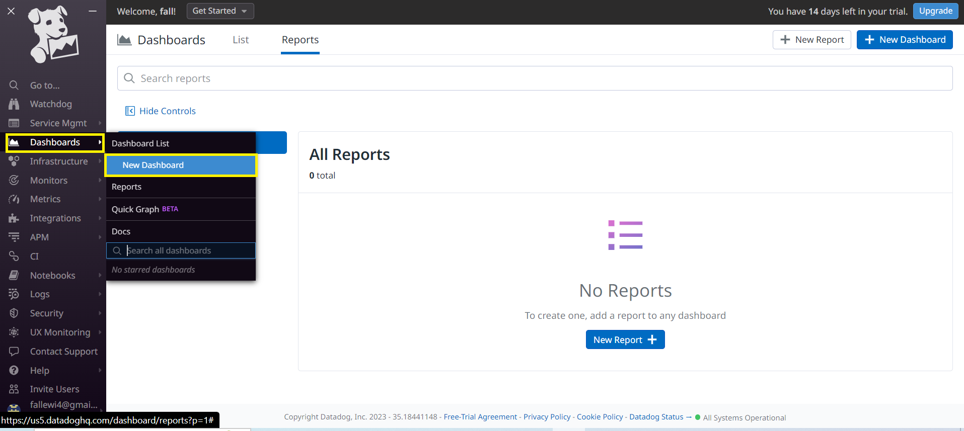
Let's create a dashboard from the Datadog interface. We can click on the Dashboard menu and the New Dashboard submenu.
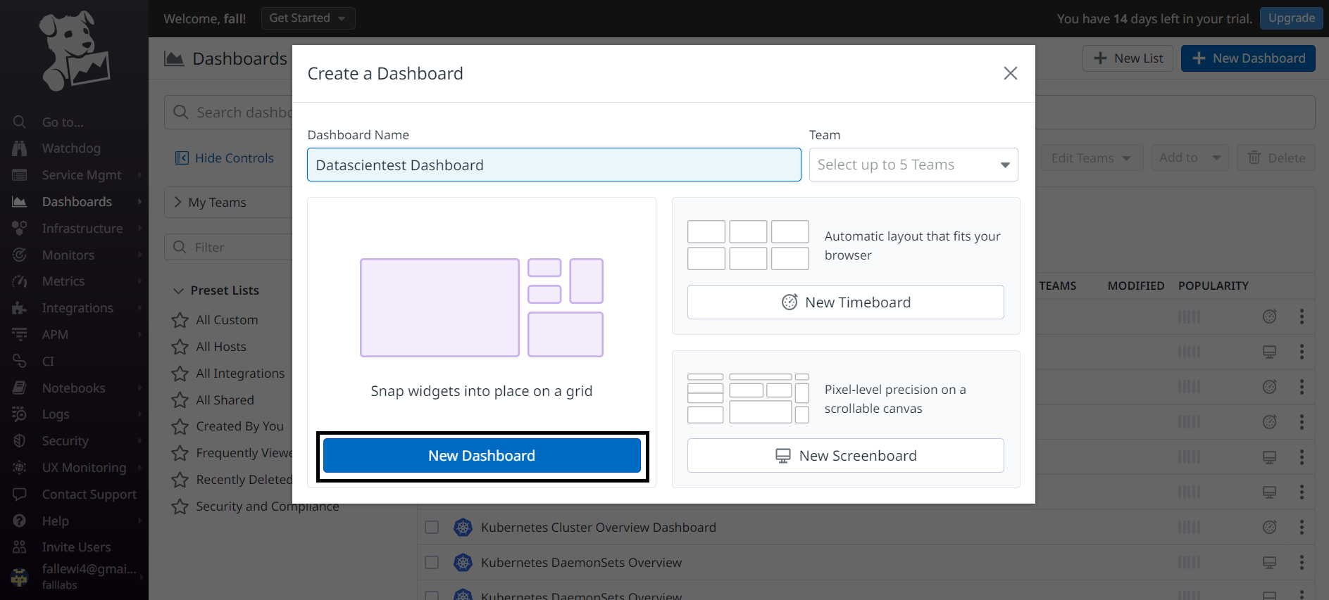
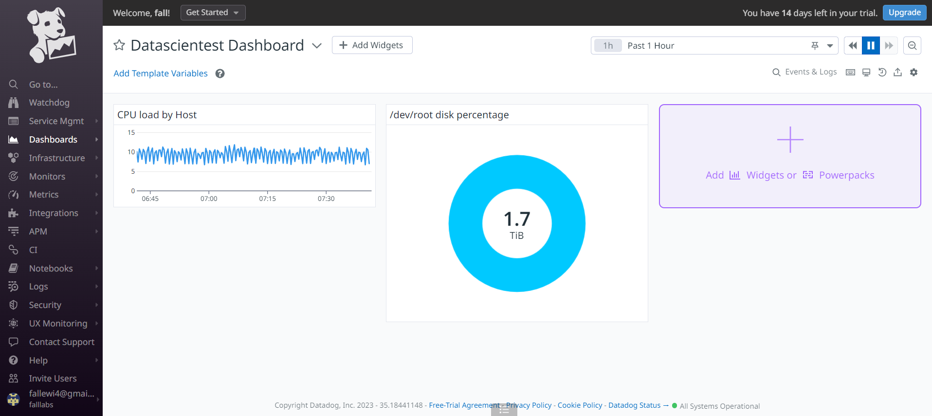
We can define a name for our dashboard. Let's call it Datascientest Dashboard and click on the New Dashboard button.
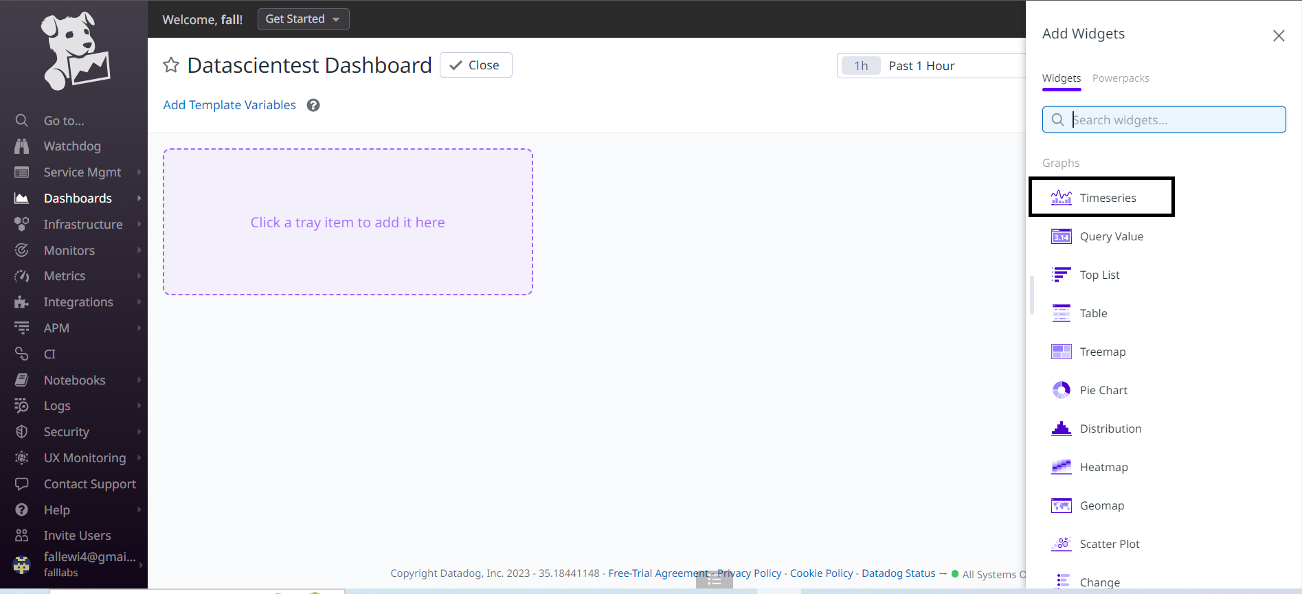
Once created, we need to choose widgets to populate our dashboard. Let's choose the Timeseries widget and then define the parameters for our widget.
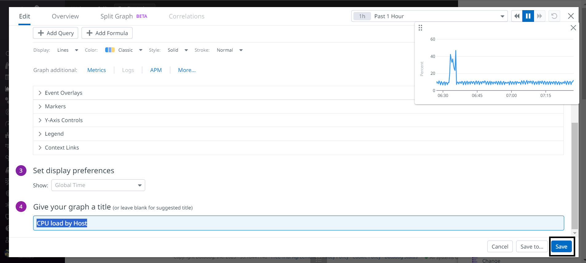
We're going to define the metrics we want to bring out in this widget, for this on the 2 part of the Graph your Data form, we'll fill in the system.cpu.user metric in order to monitor the CPU consumption of our Datascientest server. On the from field let's select the Datascientest server as the data source.
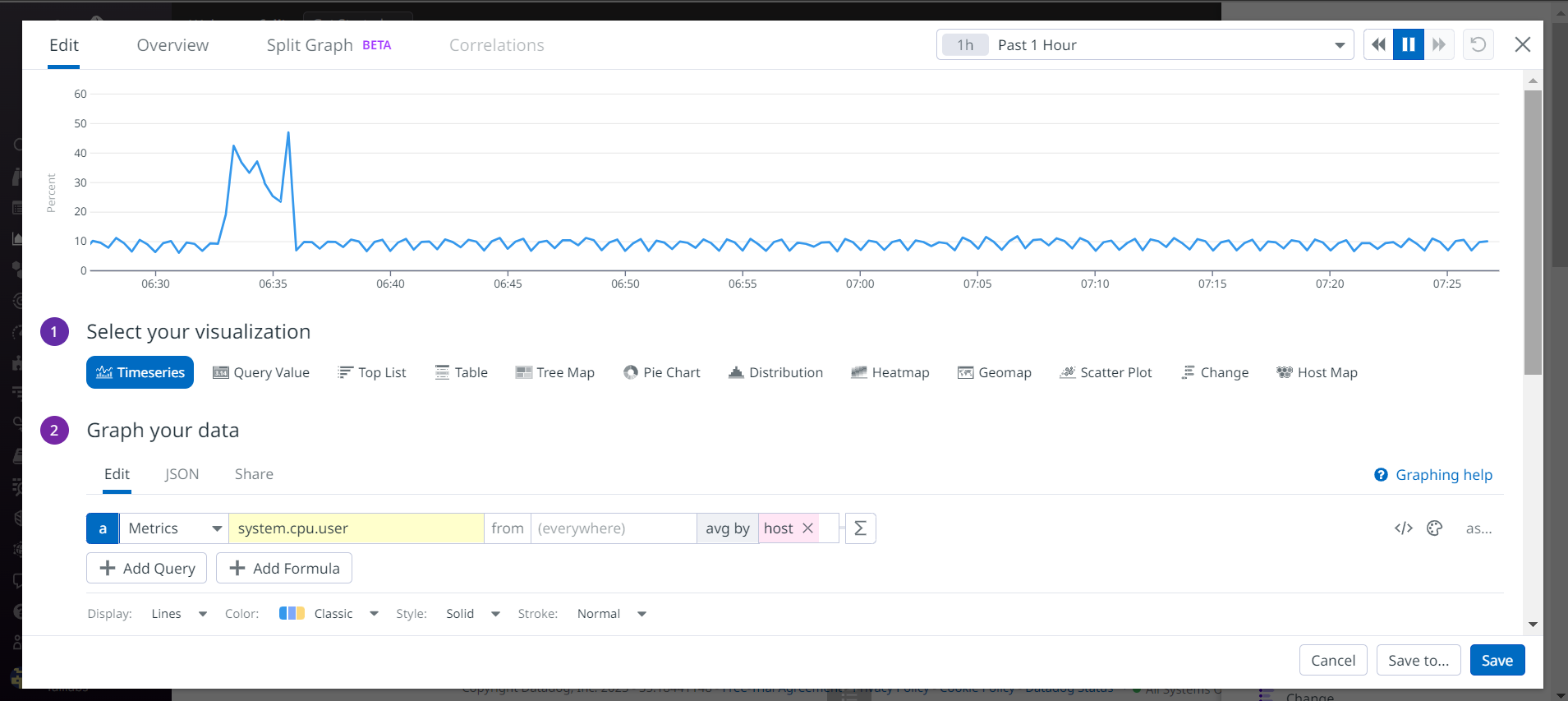
We leave the rest of the default settings on the set display preferences part. On the last part of the configuration Give your graph a title, let's give it the title CPU load by Host and then we can save by clicking on the save button.
We can now take a look at our dashboard.
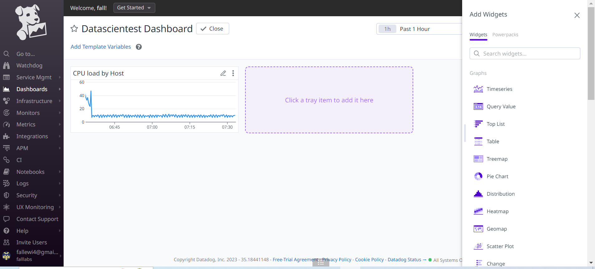
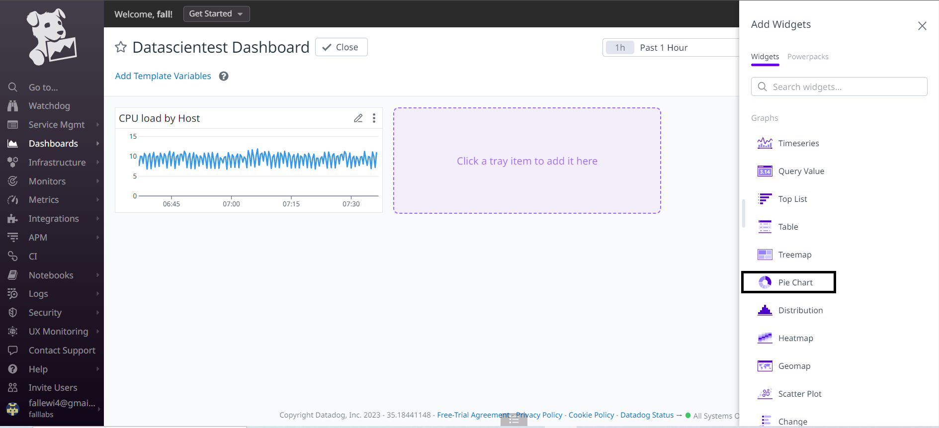
Let's also add disk space consumption for our /dev/root partition. Let's add a new Widget to our dashboard. We'll choose the Pie Chart widget.
We're going to define the metrics we want to bring out in this widget, for this on the 2 part of the Graph your Data form, we'll fill in the system.disk.free metric in order to monitor disk consumption on our Datascientest server. On the from field let's select the device:/dev/root disk as the data source.
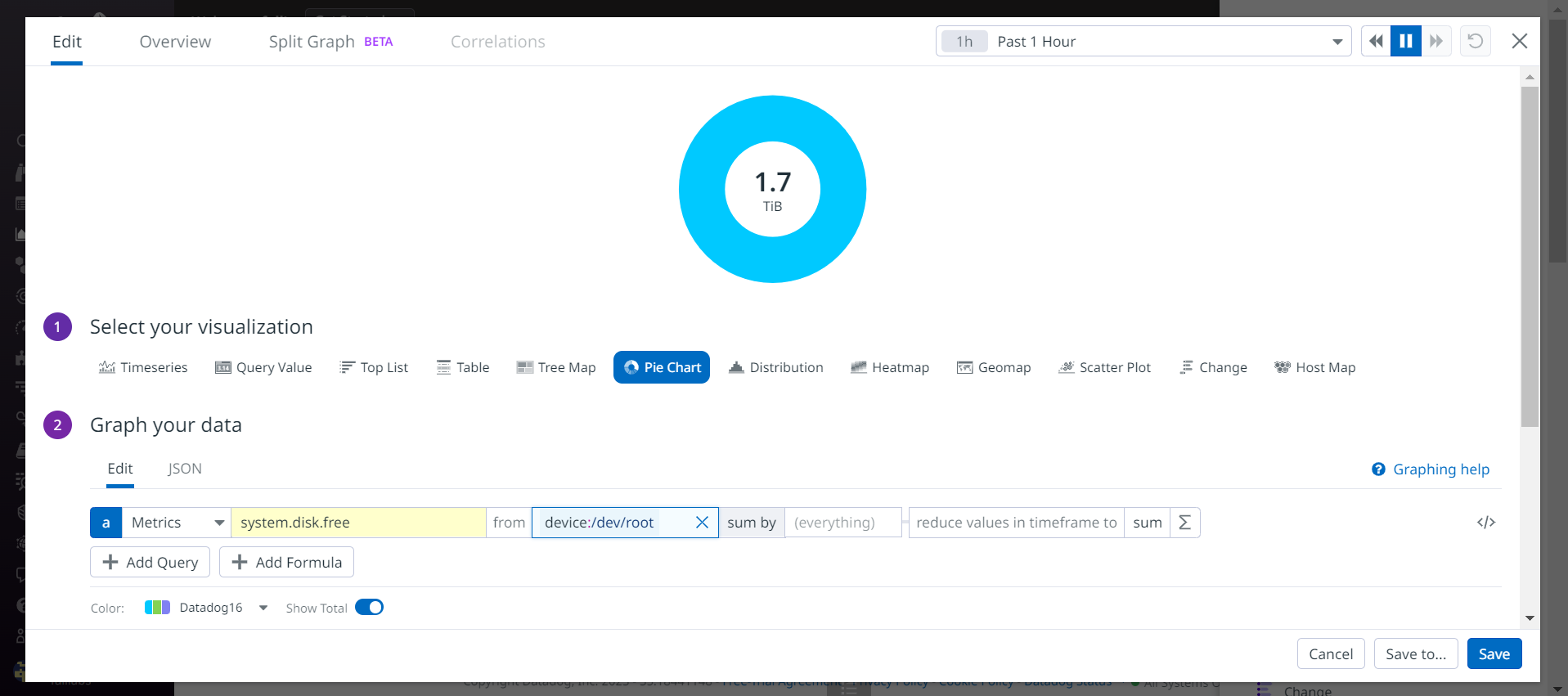
We can see the percentage of disk space consumption for the /dev/root partition.We leave the rest of the default settings on the set display preferences part. On the last part of the configuration Give your graph a title, let's give it the title /dev/root disk percentage and then we can save by clicking on the save button.
We can return to the dashboard list by clicking on the Dashboard List submenu and verify the presence of our dashboard in the list.
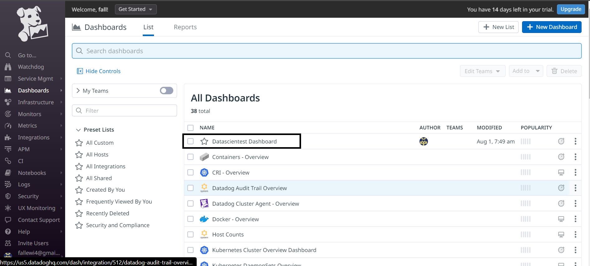
We can see that it is indeed present.